WorkSpår
The feature I cut was the one the app was built around
The notes app I built to replace Google Keep. You write a thought down without choosing anything, and later tidy the pile to zero, one tap per note.
Designer & developer, July–October 2026, in daily use since summerTry the demo with sample notes ↗Source on GitHub ↗
The number that changed it
4of 240 notes ever sorted by the feature I cut
My own archive when I finally checked: 4 of about 240 notes had ever been through the automatic sorting. The rest had never been touched.
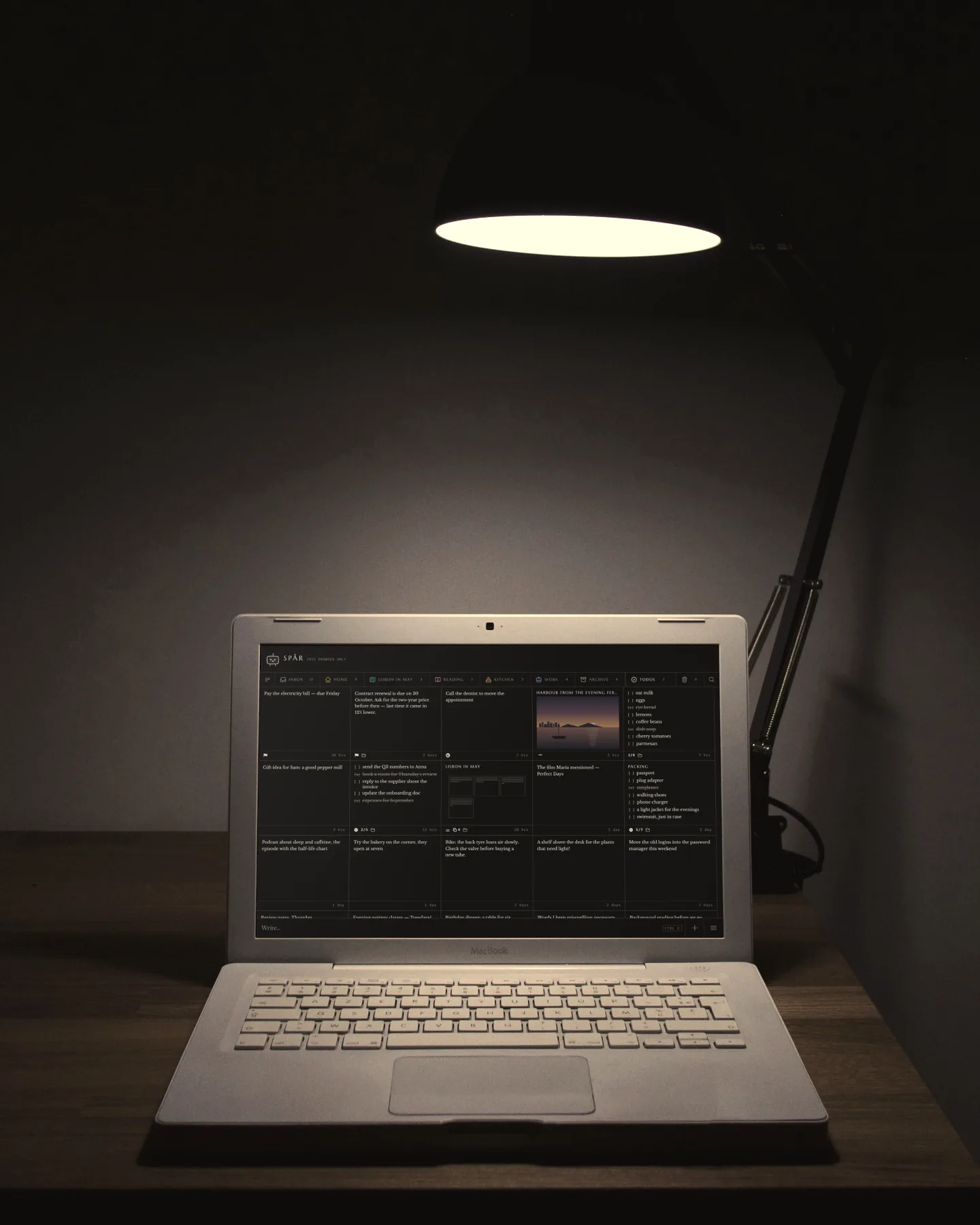
For years Google Keep was where everything went first: links, lists, quotes, half-ideas. About 26% of my notes are saved links. I opened it dozens of times a day, mostly to find something and sometimes to get a thought down before it was gone.
Over time Keep itself started to annoy me. Features got in the way, there were limits I kept hitting, I had little control over my own notes, capture felt slow, and all of it was tied to the Google ecosystem. What I wanted most was capture speed: opening the app and getting a thought down should be close to instant.
Spår (Swedish for trace) is what I made instead. It is for one person. It runs in the browser, installs like an app on a phone or a desktop, and works with no server at all. Sync is something you add on your own server, only if you want your notes on a second device.
What Keep got wrong
Keep’s idea of a note is fine. The interface is where it goes wrong, and before designing anything I wrote down the six ways it does: staggered card heights that break the reading path, no difference between a two-line jot and a pasted wall of text, organising buried in menus, no way to merge two notes, a floating button that covers content, and one long scroll of everything.
I had two competitors in mind. The first is not taking the note at all, so writing one has to cost nothing. The second is taking the note and never finding it again, and that is an interface problem too.
I cut automatic sorting, the feature the first version was built around
The first version bet that the app would organise itself. A cloud service read each note and gave it a title, a type and tags, so I would never have to file anything by hand. It felt like the obvious modern answer to a messy pile.
The automatic sorting came out completely. Notes now live in real folders that I file myself, one folder per note at most.
Read the reasoning
In use it failed twice over. It put a network round trip on the one path that has to be instant, and the tags it chose were ones I wouldn’t have picked. When I finally looked, only 4 of 240 notes had ever been processed. Unsorted was already normal.
So I took it out completely, and tags went with it. Notes now live in real folders, one each at most, like files. My decision log says why in one line: zero filing pressure sounded right and turned out to mean nothing ever got filed.
What it cost: no suggested folders and no smart search. Search is plain keywords as you type, across every note, the Archive and the words inside attached PDFs. The app’s guesses about where my notes belonged were worse than one tap of my own.
The one hue
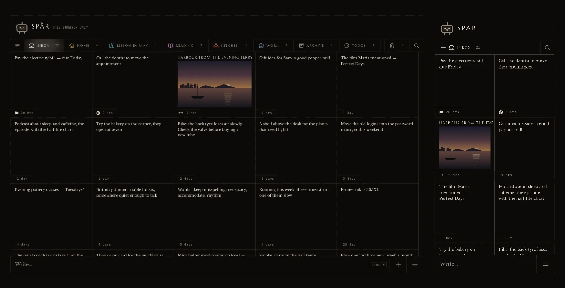
The app has no colour except a tint on a folder you made yourself. A folder is a name you chose, and you recognise a colour before you read a word. Errors, links and states stay grey.
Nothing to decide
One field, always at the bottom under the thumb. Nothing to pick before Enter, because the real competitor is not writing the note down at all.
Tidy up: one note at a time, folders as buttons
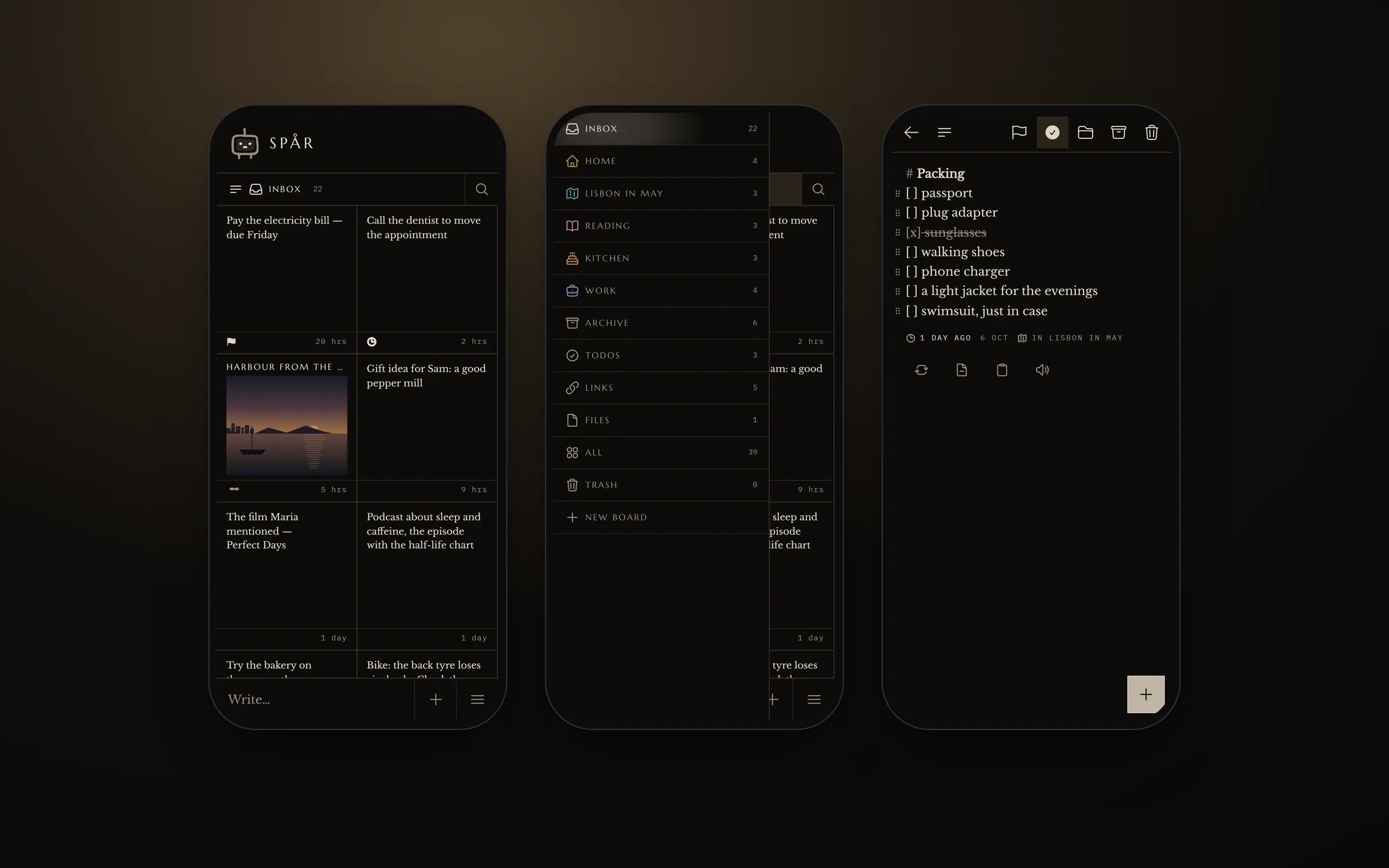
Real folders only help if filing is cheap. Filing one note meant open, Move, pick, back: three gestures and a trip back. That is a big part of why I never filed anything in Keep either. So everything you write lands in the Inbox, and Tidy up deals the pile to you one note at a time, with your folders as buttons under your thumb.
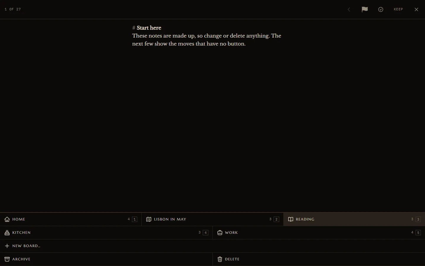
Everything lands in the Inbox, and Tidy up deals it to you one note at a time until the count reaches zero.
Read the reasoning
Everyone’s first idea here is swipe-to-file, and I said no to it. With more than two folders a swipe can’t say which one it means, so the gesture turns into a guess. Later I allowed exactly one swipe. Right keeps and left bins, two opposite answers that nobody mixes up.
The Inbox counts down. A run ends on a summary of what moved, and anything deleted in that run is offered back straight away. The old landing view went on forever, and this pile ends.
Buttons with names
Five folders can’t map onto two swipe directions without guessing. A button names where the note goes, and the number beside it makes each one a single key on a keyboard.
A pile you can finish
The counter is the point. An Inbox that counts down to zero tells you when you’re done.
Three optional marks next to Save
From the start, capture asked for nothing: one field, type, Enter, done. No title field and no tag picker. Then I kept writing notes I already knew were urgent, saving them, finding the card, opening it and pressing the flag. Four gestures for a decision I had made before typing the first word.
The fix was to keep asking and offering apart. Once there is text, three optional marks show up beside Save: important, to-do and folder. They all start off, and Enter still saves exactly as before. They are the same marks the open note uses, so there was nothing new to learn.
Enter still saves exactly as before. The marks are there only if you want them.
A week of real use rewrote the interface
After the first week I wrote down every complaint I had about my own app, in my own words, and turned each one into a change in the decision log. Most of them removed something.
Most of the changes took something away, starting with the type label on every card.
Read the reasoning
Type labels on cards went: “they take up valuable visual space (cognitive load) and do not help scan notes”. The permanent search bar moved into the menu: “I very seldom use the search function and now it takes up a lot of space”. A coloured priority stripe became a small grey flag in the card’s footer. A coloured stripe down the side is the most generic move there is.
Opening a note used to scale it up from its card, and I didn’t like the stretchy feel, every letter squashed for the length of the move. Now the note is full size from the first frame, and only its clipping edge grows out of the card.
The pop-up panels were the brightest thing on a black screen. My eye adapted to the glare and the options went flat, so I redrew them on the dark ground with an edge.
![Close-up of a checklist note: serif lines with monospaced [ ] and [x] boxes, two items struck through, and a footer reading 2/5 with a folder icon and “12 hrs”.](/_next/image?url=%2Fmedia%2Fspar%2Fv2-macro.webp&w=2400&q=75)
Darkroom
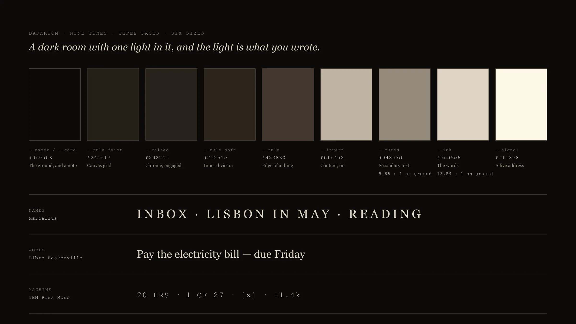
The design system is called Darkroom, after the one sentence it grew from: a dark room with one light in it, and the light is what you wrote. The note is always the brightest thing on screen. Everything else stays in the bottom fifth of the range.
It has nine warm greys, three typefaces with one job each, six type sizes and two line weights, with no spare slots. Marcellus sets names, Libre Baskerville sets every word you wrote, and IBM Plex Mono sets the machine’s counts and stamps. There are no rounded corners, shadows or accent colour. A card has no fill and is drawn with hairlines only.
Read the reasoning
I measured the contrast: 13.59:1 for note text and 5.88:1 for secondary text, both above WCAG AA. The one exception to “no colour” is a folder you made, which may wear one of eight tints. Each tint is held to the brightness of an existing grey, so it shifts the tone without lighting it up.
There is exactly one drawing, a small machine with a face that also shows sync state. When a note lands it nods once, for 0.7 seconds, like a receipt. It never grows a message or a streak, and with reduced motion on it doesn’t move at all.
A card is the ground
The note surface and the background are the same value on purpose. Lifting the cards would push the app in front of hundreds of notes, and the hairlines already keep them apart.
Ink stops short of white
Pure white glows on near-black when you read a lot of it. Stopping below white also leaves headroom, so a link can be brighter than text without any colour.
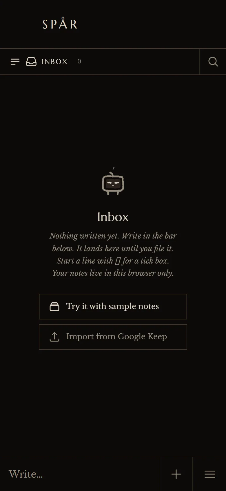
An empty state that teaches
No cheerful illustration and no apology. It says where a note lands and how to make a tick box, then offers the two real ways to start, sample notes or your own Keep archive.
Local first, and everything undoable
I built it as a web app that keeps everything on the device first. Every change is saved there, and sync runs afterwards. Open, capture, edit and find each have a 50 ms budget. The app times its own answers on your device and shows the medians on its About page, and those timings are never stored or sent.
The words you first wrote are kept forever, however much you edit. Delete means the Trash for 30 days, and filing, archiving, merging and importing can all be undone. Merging two notes makes an idea with a canvas to arrange them on, and Un-merge puts both back where they were.
Read the reasoning
Moving in and moving out are both easy. A Google Keep export is read on your device, each label is offered as a new folder or left in the Inbox, and one undo removes a whole import. Download everything saves the archive as plain text files in folders that open without Spår. Sync, if you want it, runs on your own server in a single container.
Every rule is written down with its reason, from the first spec to the current build, including the ones I later took back. The source is public on GitHub.
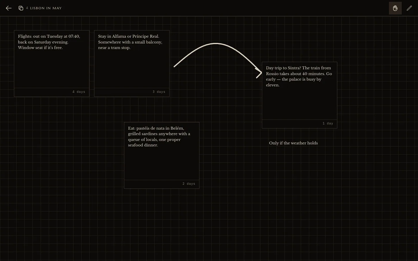
Merge is cheap because it is reversible
In Keep, combining notes meant copy, paste and delete, so I never did it. Here it is one drag, and Un-merge puts both originals back, so trying it costs nothing.
Living with it
Spår replaced Google Keep for me. It holds about 240 notes, and I open it on my phone and my desktop many times a day. Filing now happens in short Tidy up runs. In Keep it mostly didn’t happen.
The public demo runs entirely in the browser with invented sample notes, and nothing typed there is sent anywhere. The app is mostly about how it feels to use, which is easier to try than to describe.
What I should have tested first
I built automatic sorting first because it sounded like the answer, and the evidence against it showed up early. Almost nothing was being sorted, and what was, I would have sorted differently. Next time I will test the riskiest assumption on my own real notes before building anything on top of it.
The speed promise isn’t kept everywhere yet. On a phone slowed down to act like a slow device, the first search keystroke stalled for 370–530 ms before the letter even showed. I should have been measuring on the slowest device I care about from day one.
Some trade-offs are deliberate and still open: no end-to-end encryption, no native apps or widgets, no sharing. Each would make it a different product for a different person, and the decision log says so.