WorkNappa
A complicated prediction, readable at a glance
A fishing map for the phone. It ranks every Finnish lake and the whole coast by where and when fish bite, and says how sure it is.
Designer & developer, Sep – Oct 2026
The number that changed it
18:00the best hour on Kallavesi that day, for pike
The app’s own timing model for pike on Kallavesi, 5 October 2026, run on that day’s recorded wind and cloud. Each hour relative to the best one; the map turns this into one word per hour.
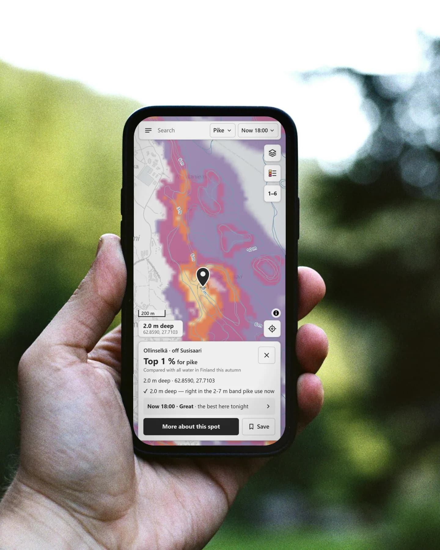
Nappa (Swedish for "to bite") started on a fishing trip in September 2026, where I caught a 110 cm pike. That catch became part of the app’s first testing data. Nappa is a map for the phone that predicts where and when fish are likely to bite, on every Finnish lake and along the whole coast, for seven species.
I fish a lot. I started as a kid with my dad, and these days I mostly fly fish.
The app runs on open Finnish data: shorelines, depth surveys, reed mapping and live water temperatures from SYKE, fish records from Luke, weather and sea data from FMI and Open-Meteo, sea charts from Traficom, background maps and place names from Maanmittauslaitos, and local rules from the national fishing-restriction service.
The fishing apps I compared give you a score with no reason behind it. I wanted one that shows its working and admits when it is guessing.
Too many moving parts
The prediction really is complicated. A spot's score is habitat (depth for the season, distance to reeds, shelter from waves, drop-offs) multiplied by timing (light, wind, water temperature, water level, cold upwelling on the coast). Each fish changes season at its own water temperature.
My first interface showed all of it. The spot card had a 0–100 bite index, a national rank and a third percentage relative to the area in view, in two different colour scales. A spot in the best 2 % of Finnish water could read "31 Poor" late in the evening, just because fish bite less at night.
And it had to work where fishing happens: on a phone in one hand, in sunlight, sometimes with gloves on and patchy signal. The map got about 40 % of the screen, and the time slider had 240 one-hour steps that no thumb could land on.
I had to get all of that into one glance on a phone, and still show how unsure it was.
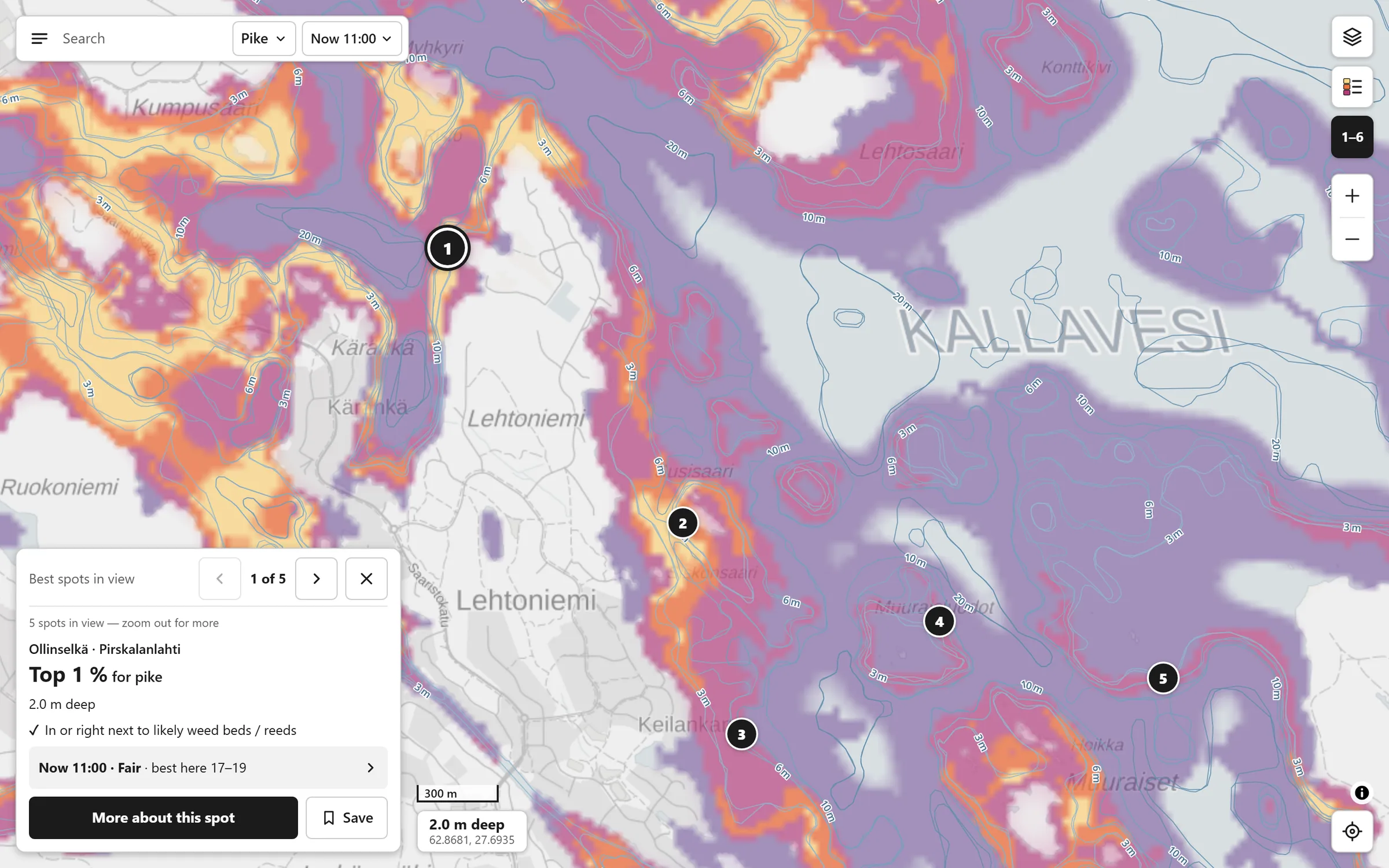
Best spots on demand
The numbered spots stay hidden until you ask for them. The pager then walks through them one at a time on the map itself, so comparing spots never means leaving the map for a list.
One ruler for places, one word for hours
I split the prediction into the two questions anglers actually ask. The first is where. Every square is ranked against all water in Finland for that fish and season, and the map shows four bands: Top 40 / 15 / 5 / 2 %. Average water stays uncoloured and is labelled "fewer fish, not none".
Each spot now gets one national rank, like "Top 1 % for pike", and each hour gets one word.
Read the reasoning
The second is when. Every hour gets one word, Quiet, Fair, Good or Great, measured against the same place's coming week. The bite-index number left the screen completely.
A national rank keeps its meaning when you pan, so a spot never changes colour because you moved the map. What I gave up was the look of precision. A 0–100 number feels exact, but it was the one people misread.
The colour ramp runs from dark purple to pale gold and gets lighter at every step, so it still reads in greyscale, in bright sun and for most colour-blind people.
The version I threw away
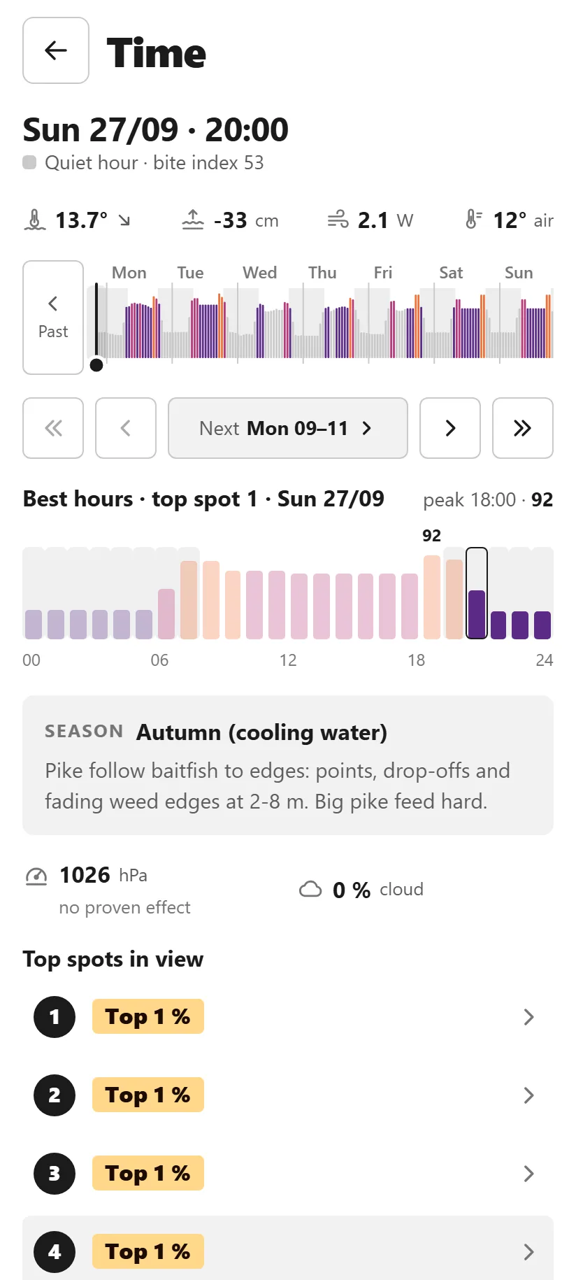
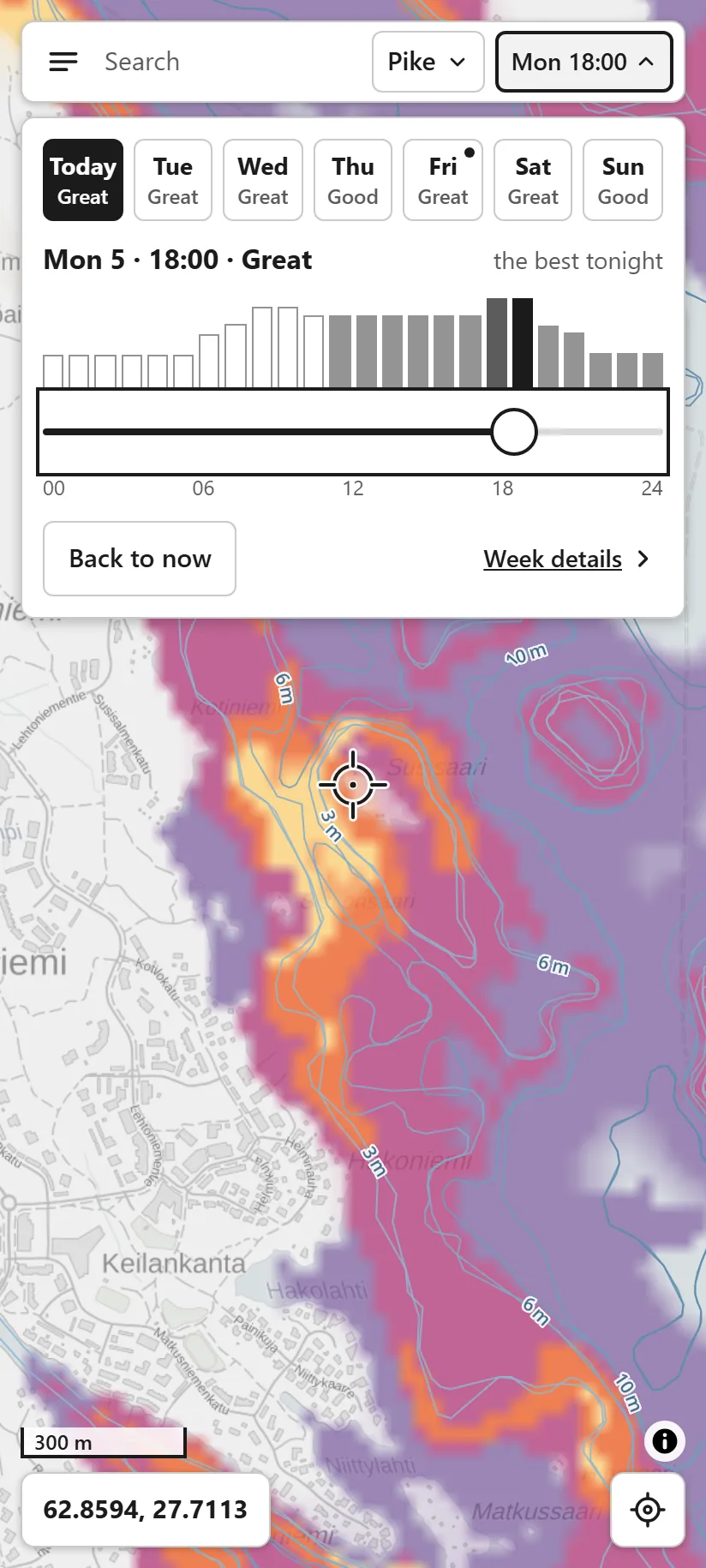
Each day shows its best word, so you can plan a trip from the week first and pick the hour after.
The slider recolours the map underneath while you drag. The bars show the shape of the day, and the map shows where.
Strip the screen back to the map
Before this I designed and shipped a complete dark theme, with a three-step bottom sheet for time and spot details. On a real phone it failed. The panels still covered most of the map, and a style clash meant every tap in the fish picker selected Trout. On desktop only about 54 % of the window was map.
The map now fills the phone screen, and time moved into a chip in the top bar.
Read the reasoning
So I stopped styling and went back to plain wireframes. I studied Retkikartta, the Finnish outdoor map, on a phone and measured it: its controls cover about 8 % of the screen at rest. I kept its layout (search on top, one column of square buttons, a readout in a corner, a small card first and a full page after) and fixed what didn't work for me. Its 32 px buttons became 44 px targets, and search finds lakes first.
Time moved out of the bottom sheet into a chip in the top bar, which opens a drop-down with the week, the day's hour bars and a slider. Looking through the whole week in detail now means opening a page. I accepted that to get a map that fills the screen.
Throwing away a finished theme stung. The wireframes were quick, though, and they answered the questions the polished version had hidden.
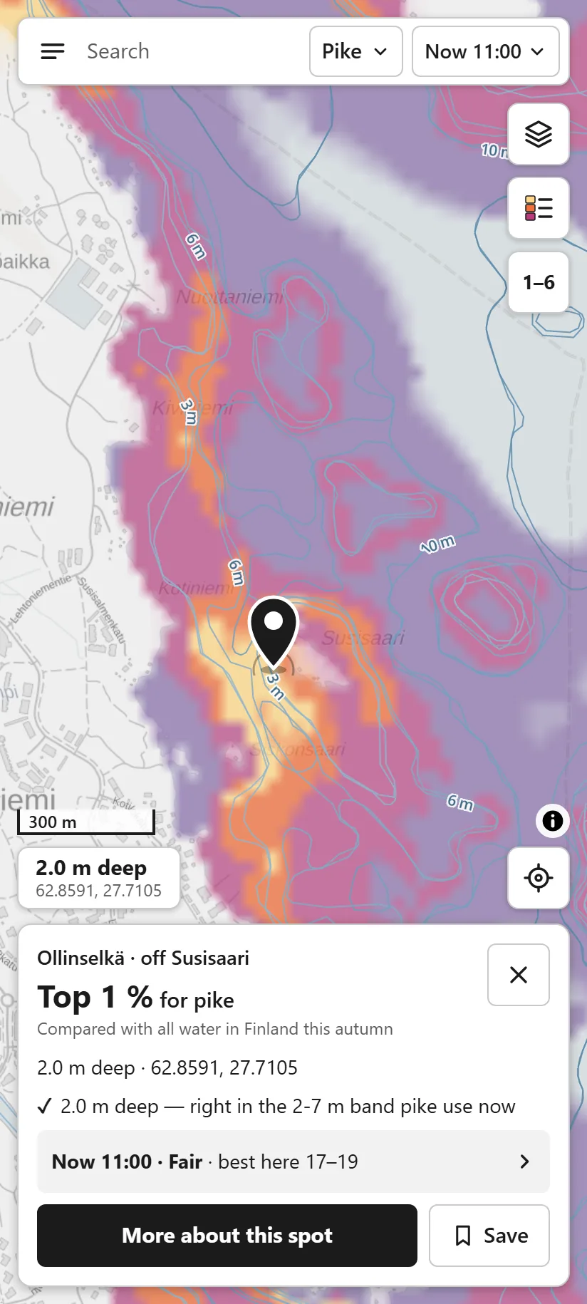
The version I threw away
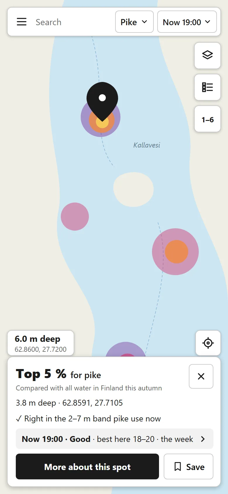
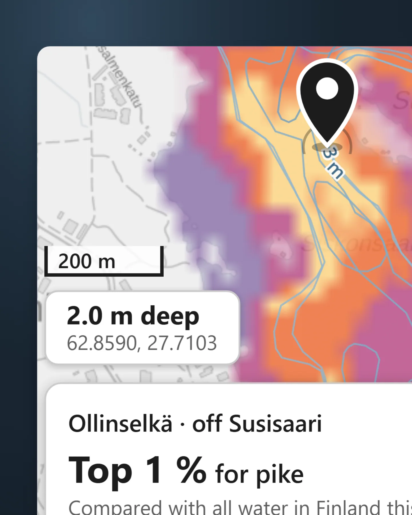
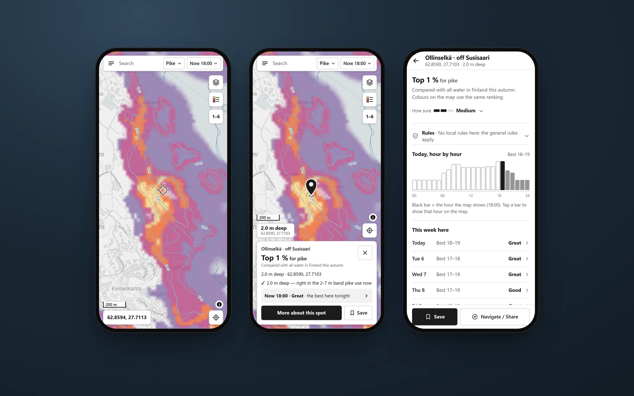
One headline where there used to be three numbers. The rank is national, so it means the same on any lake and never shifts when you pan.
The hour sits in its own row as a word. Tapping it opens the time drop-down, so "when" is always one step from "where".
Say how sure, and why
A prediction from open records is never certain, and anglers know their own lakes. If the map oversells once, they stop trusting it. So every spot page shows "How sure": Low, Medium or High. It comes from how close the real fish records are, whether the depth was measured or estimated, and how that species' map scored in tests.
Every spot page says how sure the map is, with the reasons one tap away, and a pike spot never claims more than Medium.
Read the reasoning
The rating is capped by that test. The pike map is a rough guide (6 in 10 in tests), so a pike spot never claims more than Medium.
"Why here" lists the strongest reasons in plain words, with a tick for and a cross against, and the research source a tap away. Estimated depth reads "about", and air pressure is shown "for info" because studies found no reliable effect.
The same rule holds behind the screen. A new effect only goes live if it passes a check against open fish records from areas I kept out of tuning. Several that I built, like a brown-water penalty and a depth shift for water level, failed and stay switched off.
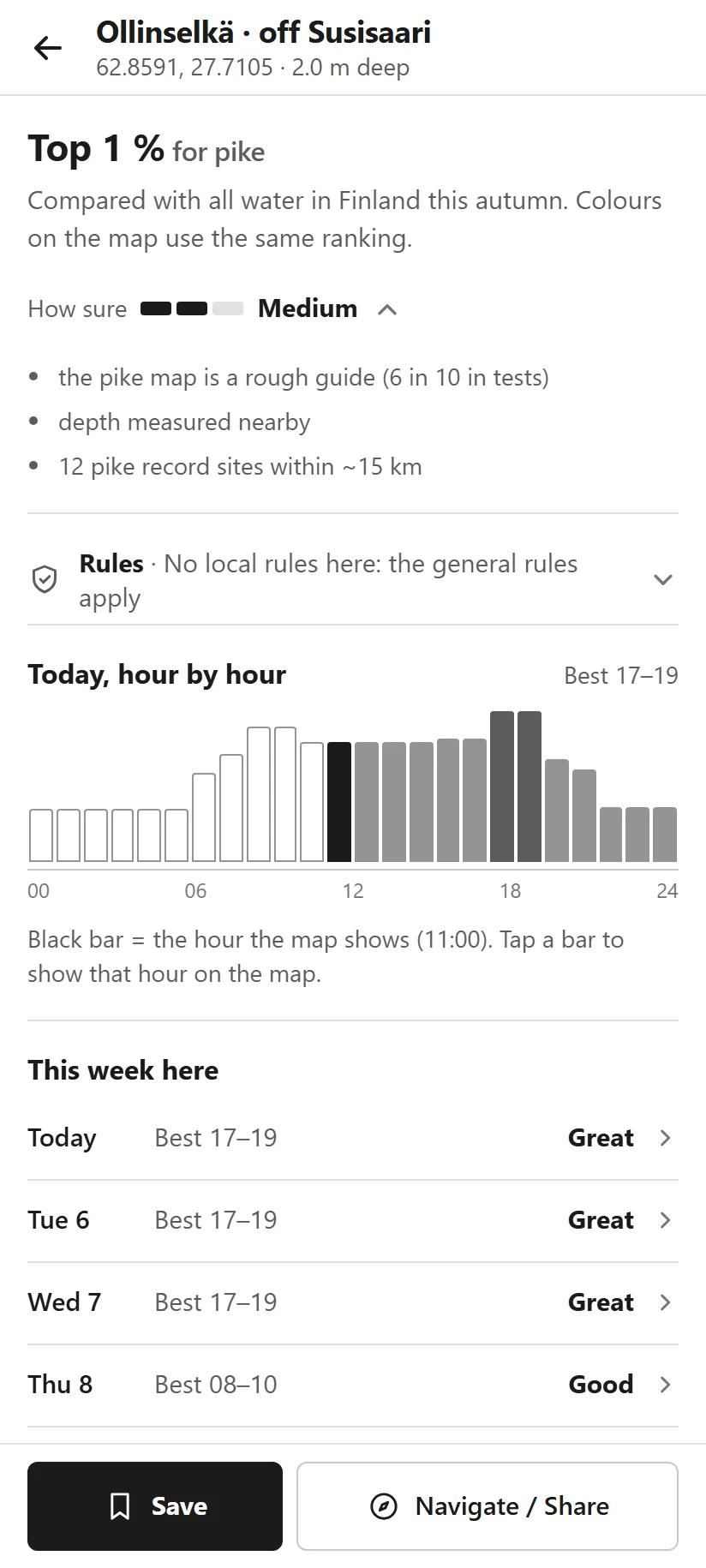
Three bars and a word. It is capped by the species' own test result, so a rough-guide map can never look certain.
Opening it shows the reasons, so you can check "Medium" for yourself.
From open data to one word
A data pipeline turns the national open data into 4,705 map tiles. Each tile is a grid of 25 m squares holding depth, reeds, shelter and drop-offs. Every species has its own settings file, every number in it has a research source, and guesses are labelled as guesses.
The app itself is a static site. The browser fetches tiles, live water temperatures and the forecast, and works out the score on the device, so panning and scrubbing through time stay fast.
The interface splits the same way the prediction does. Colour answers where and a word answers when, with a short reason underneath. The map key explains it once, in the same words the map uses.
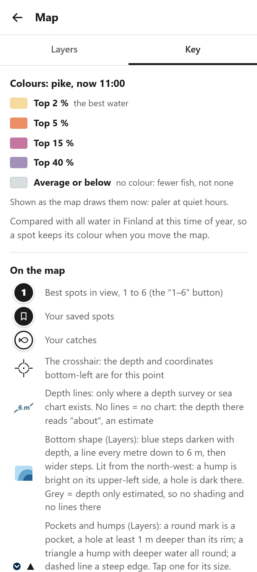
The colours come in fixed bands. Each step is a set share of Finnish water, so orange always means the same thing.
Average water stays uncoloured. "Fewer fish, not none" stops people reading blank water as empty.
Building it alone
I built Nappa alone, from the data pipeline and the prediction to the interface and the server. Every change had to pass the tests and a build before it went live.
The redesign ended with a full UX review of the app at phone sizes. Of its 63 findings, I accepted 62 and shipped them in three waves: plain-language fishing rules on the spot page, Back and Escape closing what you expect, spots named after the nearest water and island, a "Best water near me" list, and offline areas for lakes without signal.
The same work fixed the empty zoomed-out map. Far out, the map now shows the best water in each 500 m square and marks the stand-out lakes, so you get an idea of where to go before you zoom in.
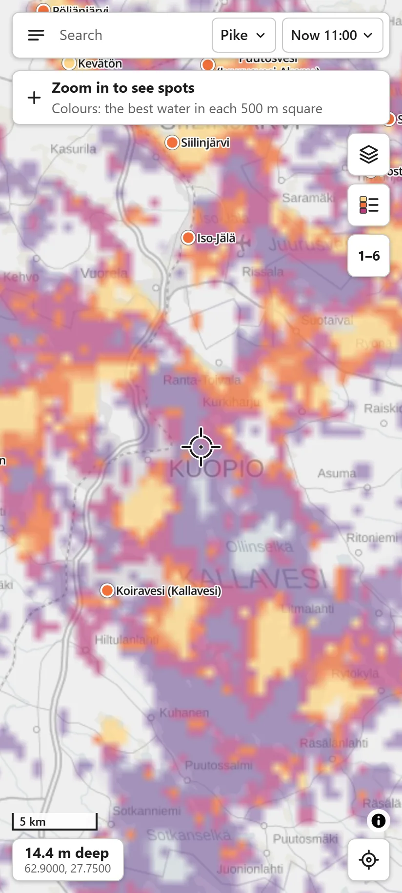
Zoomed out, colour shows the best water in each square, and one line tells you what to do next.
On the water
I use Nappa in season and out of it. I plan trips with it at home and check it again on the water. It covers every Finnish lake and the whole coast for seven species.
The spot card now answers in one line what used to take three numbers: the rank, the strongest reason and the best hours. The full reasoning is one tap deeper, for when you want to argue with it.
It runs privately for now. Publishing it would mean hosting about 1.3 GB of static map data and translating the interface into Finnish.
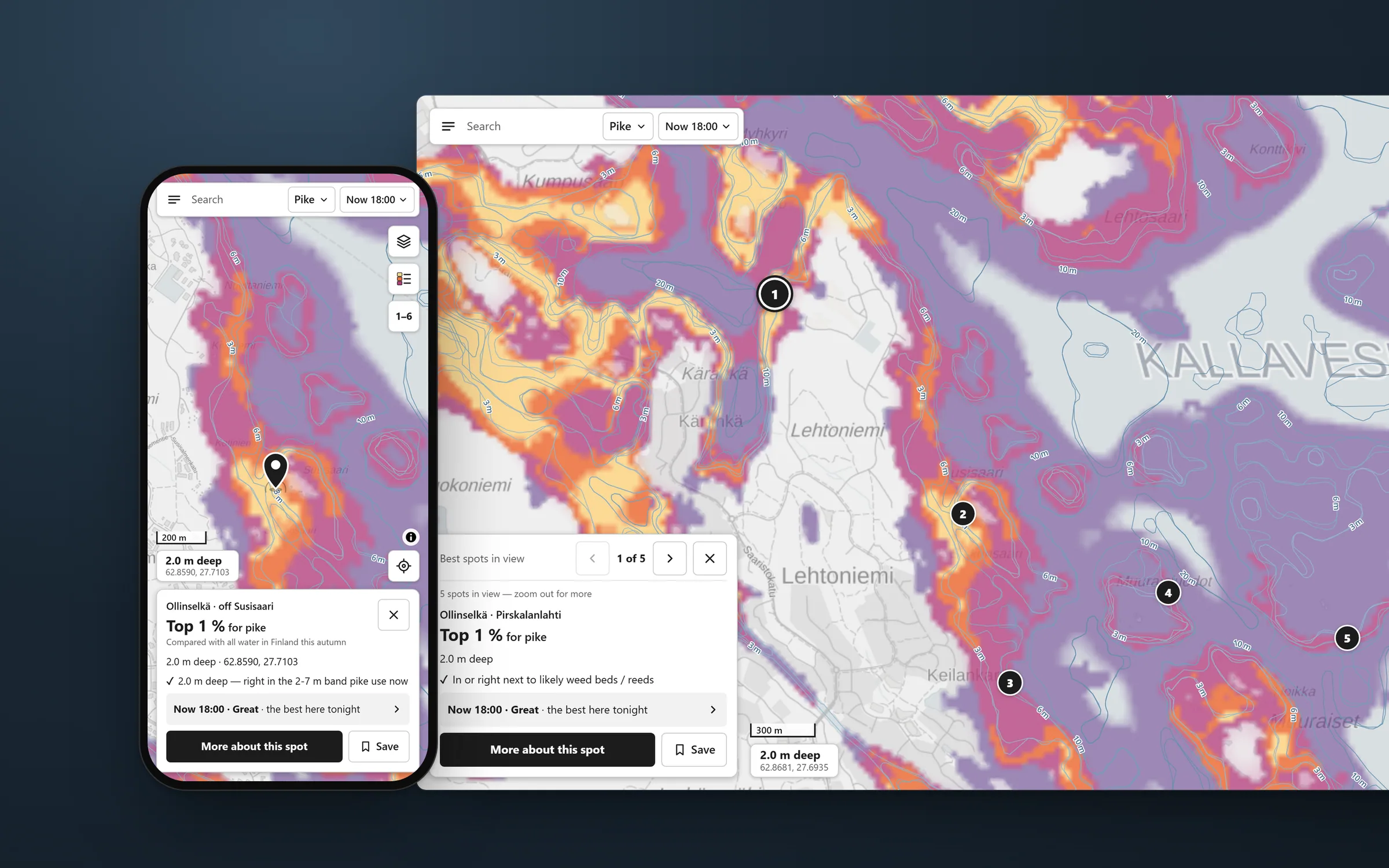

What I got wrong
I styled too early. The dark theme looked finished on a design board and broke on a phone.
Next time I will wireframe and test at real phone size before I choose a look.
The limits stay visible. Open records barely separate good from average water inside one lake (a test score of 0.54), and the map is much better at telling areas apart. So the key says "rough guide".
Next on the list: catch data from test fishing to retest the effects that are switched off, and a Finnish interface for the people it is really for.