Workoeksound
Four audio tools that show what they hear
I was oeksound's only designer from 2019 to 2024. I designed or redesigned four audio plug-ins onto one shared interface system, for studios and for live-sound consoles.
Sole product & visual designer, 2019–2024oeksound.com ↗soothe live ↗bloom ↗
The number that changed it
9/10MusicTech’s score for bloom, with its “fluid and intuitive user interface” listed among the pros
Illustrative: the kind of curve soothe draws. The solid line is the input, the dashed line what is left after the resonance is cut.

oeksound is a small Helsinki company that makes audio plug-ins for mixing engineers. The plug-ins listen to the signal and react as it changes. soothe finds harsh resonances and turns them down; spiff and bloom do the same kind of thing for transients and tone.
I joined in 2019 as Visual & UI Designer and was the only designer there until 2024. Day to day I worked with the founders, the developers and the rest of the team. Besides the interfaces of soothe2, soothe live, bloom and spiff, I did the brand, the website, print ads and social posts.
soothe and spiff already existed when I started (spiff since 2018). soothe2 was rewritten from scratch and released in early 2020. It was the first product where the interface was mine from day one.
Processing you can’t see
You can’t see adaptive processing. A normal EQ does exactly what its curve says. soothe decides from moment to moment what to cut and by how much, and if the engineer can’t see that, they either don’t trust it or push it too far.
Sessions move fast. An engineer gives a new plug-in a few seconds before deciding whether it stays on the channel. On stage there is even less time. The input changes every night, and the plug-in gets adjusted in the middle of a show.
The company was also going from one flagship to a family of products, and every new plug-in had to feel like it came from the same place.
Colour follows focus
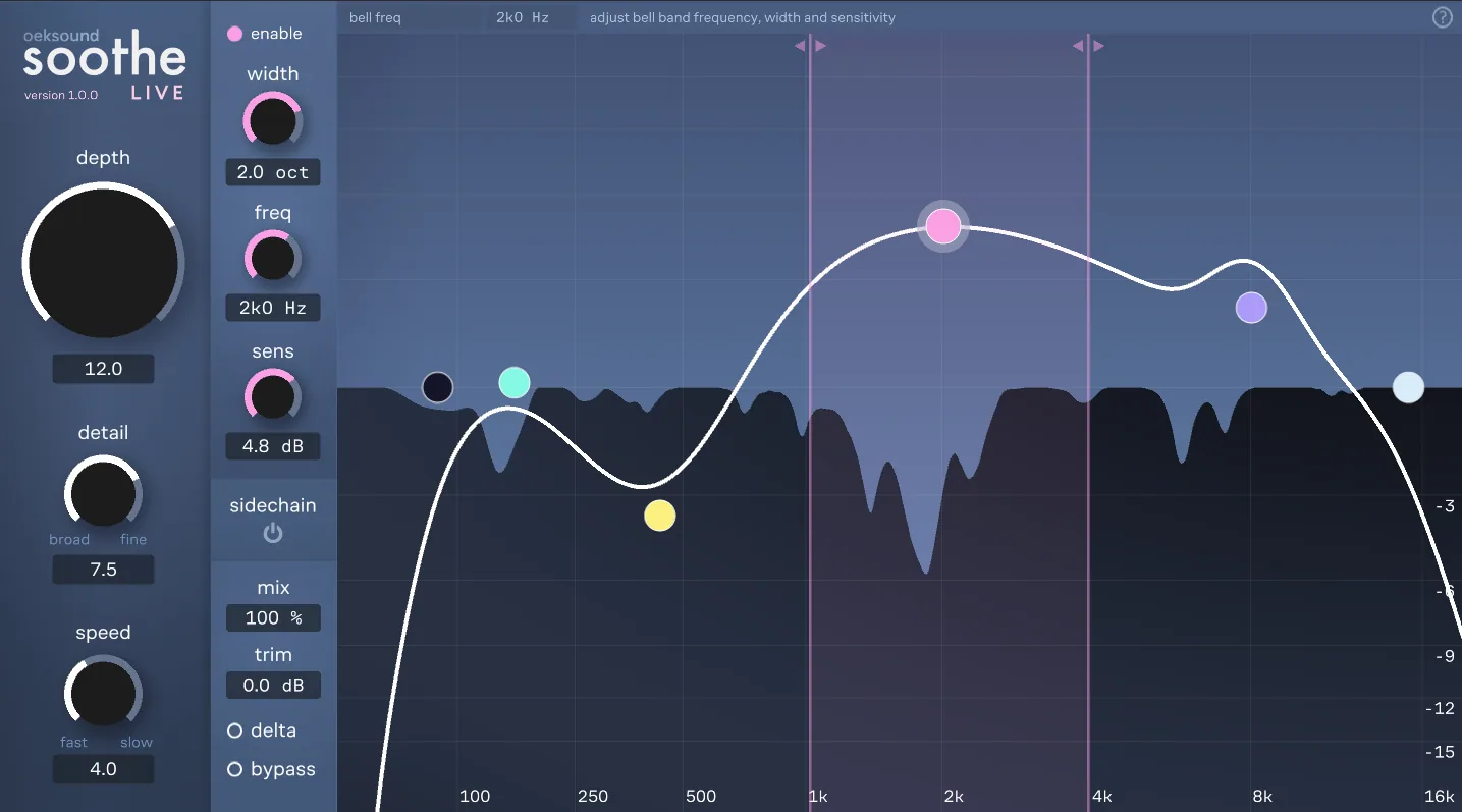
The band column takes the colour of the selected node. With five bands on screen, the pink arcs tell you which one you are editing before you read a label.
Help without hover
A touchscreen has no hover, so tooltips were out. The bar along the top names the control you are touching and says in plain words what it does.
All four plug-ins share one header and one set of controls
I treated the plug-ins as one product with different engines inside. They share the same header (undo, redo, A/B, A→B copy, presets, help, settings, resize), the same knob with an editable value field beside it, and the same bypass switch.
If you know soothe2, you already know how to drive bloom, and colour is what tells the products apart.
Read the reasoning
Engineers jump between plug-ins all session and shouldn’t have to look for undo every time. For us it also meant a new product started from parts we already had.
The price was that layout could no longer tell the products apart. Colour and the wordmark do that now: grey-blue soothe2, steel-blue spiff, rose-pink bloom and night-blue soothe live.
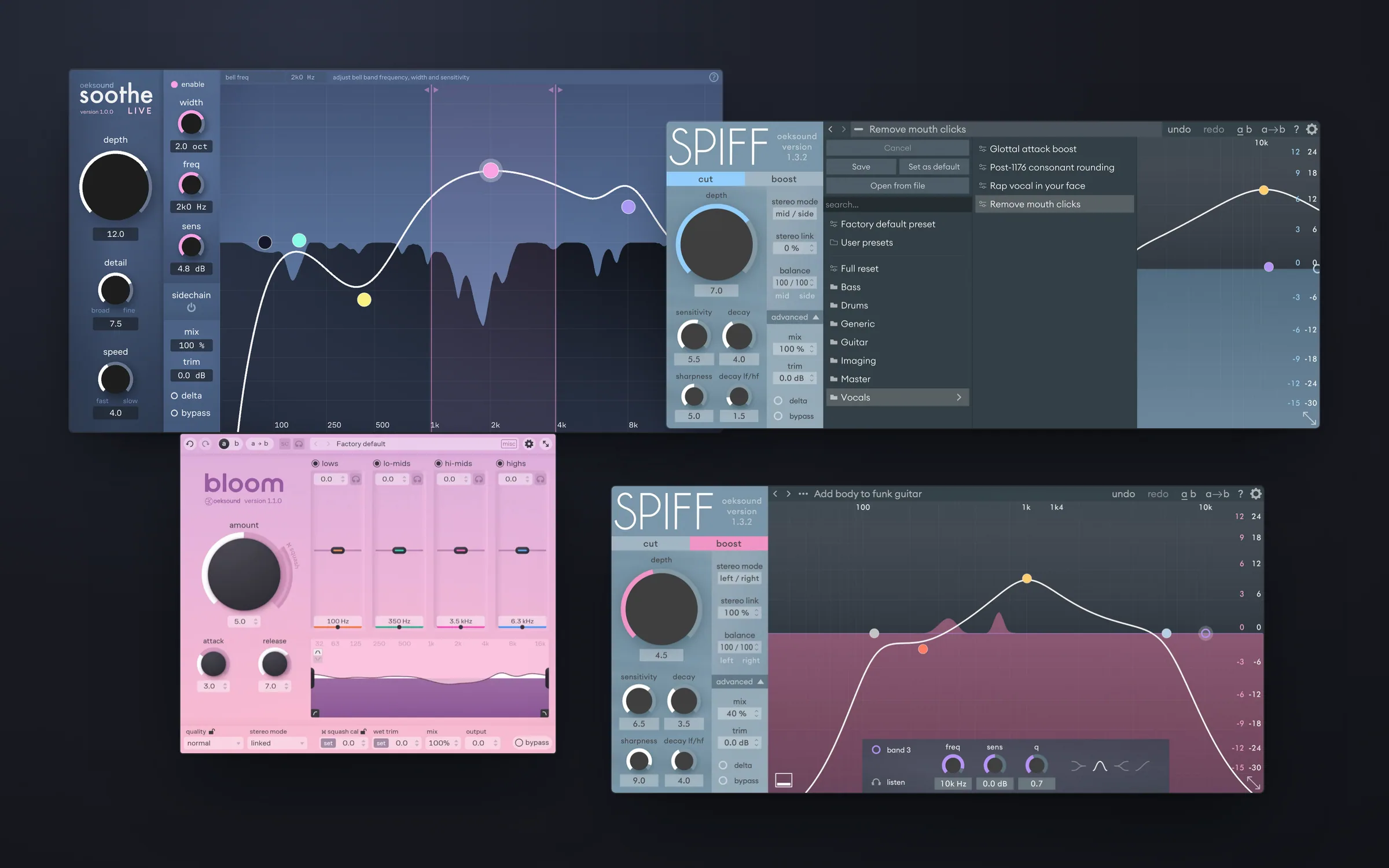
Same header, every product
Undo, A/B and presets sit in exactly the same place in every oeksound plug-in, so muscle memory carries over from one to the next.
Presets named by problem
Presets are filed by source and named after the problem they fix, like Remove mouth clicks. You start from what you hear, and the settings come with it.
Mode you can see from across the room
Cutting and boosting transients sound very different. In boost mode the whole graph turns pink, so you can tell which one is on without reading anything.
Showing what the plug-in is doing right now
The main visual idea is two things on one graph. The white curve and the coloured nodes are what you asked for. The moving shape underneath is what the plug-in is doing about it, live.
One graph shows what you asked for and, underneath it, what soothe is actually cutting at that moment.
Read the reasoning
With both on screen you can read the process and correct it. If soothe is cutting somewhere it shouldn’t, you see it, grab the nearest node and pull that area back. Recording Magazine wrote that you get “very good visual feedback about which frequencies are being attenuated and by how much”.
Delta plays only what is being removed. I put it right next to bypass, because hearing what goes is the fastest way to trust that it’s the right thing. Sound on Sound said soothe2 does more than the first version “without noticeably adding to the plug-in’s complexity or slowing down the user”.
Intent above, action below
The curve is what you asked for, and the moving spectrum is what soothe is doing about it. Seeing both at once is what makes people trust something they otherwise can’t see.
Docked under the graph
Band settings open in a panel under the graph instead of a pop-up. The graph stays in view, so you see each change take effect while you make it.
A touchscreen has no hover, so the tooltips went
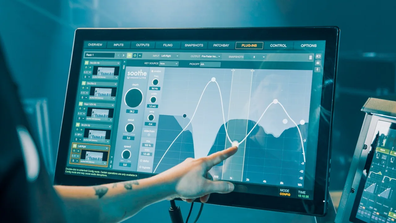
soothe live runs on Avid VENUE | S6L consoles. It is used by touch, at front of house, often in the dark. The studio plug-ins explain each control in a tooltip when you hover over it, and a finger can’t hover.
On the console, a fixed help bar replaced the tooltips and the selected band’s controls got a column of their own.
Read the reasoning
I took the tooltips out and put a fixed help bar along the top. Touch a control and the bar names it and says in plain words what it does. It takes a strip of screen all the time, which a tooltip never did. On a console I thought that was the right trade.
I rebuilt the rest of the layout for the same conditions. Band controls moved out of the floating panel into a fixed column, so a finger finds width, frequency and sensitivity in the same spot every time. The darker palette suits a dark venue and keeps the graph readable at a glance.
Live engineers noticed. Sean “Sully” Sullivan wrote that with soothe live “any problem is easily solved in zero time”.
Built for a finger
On a console there is no mouse and not much time. The selected band’s controls always sit in one fixed column, so nobody has to hunt for them mid-show.
bloom: one knob first
bloom shapes the tonal balance of a whole track or mix. That job usually means a multiband compressor and a lot of parameters. I put one big Amount knob first and pushed everything else down.
Reviewers found it quick to pick up, and the one thing they missed was a delta switch.
Read the reasoning
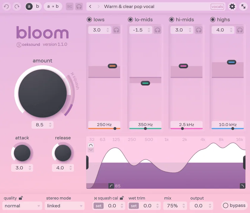
The four tone bands are pads with colour-coded handles, and each colour runs down to its own frequency rail. Sound on Sound counted “just five main controls” and called the Amount control self-explanatory.
Expert users paid for that. Attack, release, quality and calibration are all still there, only smaller and further down. MusicTech’s one interface complaint was “no delta listen mode”, and it was a fair one.
The ring shows the next mode
Past a certain point, turning Amount up switches on squash mode. That range is drawn on the knob’s own ring, so you can see where the sound changes character before you get there.
Colour as a link
Each band’s handle colour runs down to its frequency rail, so you can tell which handle owns which range without extra labels.
One kit under four products
Under the products is a small kit: knobs in a few sizes, value fields with steppers, toggles, band nodes, the band panel and the header. Each plug-in has its own palette, but the parts look and behave the same everywhere.
Colour carries state too. In spiff, cut mode is blue and boost mode turns the whole graph pink, so you can’t mistake which way it’s pushing.
I also looked after the brand: the brand book, the website, print ads in Sound on Sound and Future Music and the social posts. The website follows the same rule as the plug-ins. Every product keeps its own colour, and the interface itself is the main image.
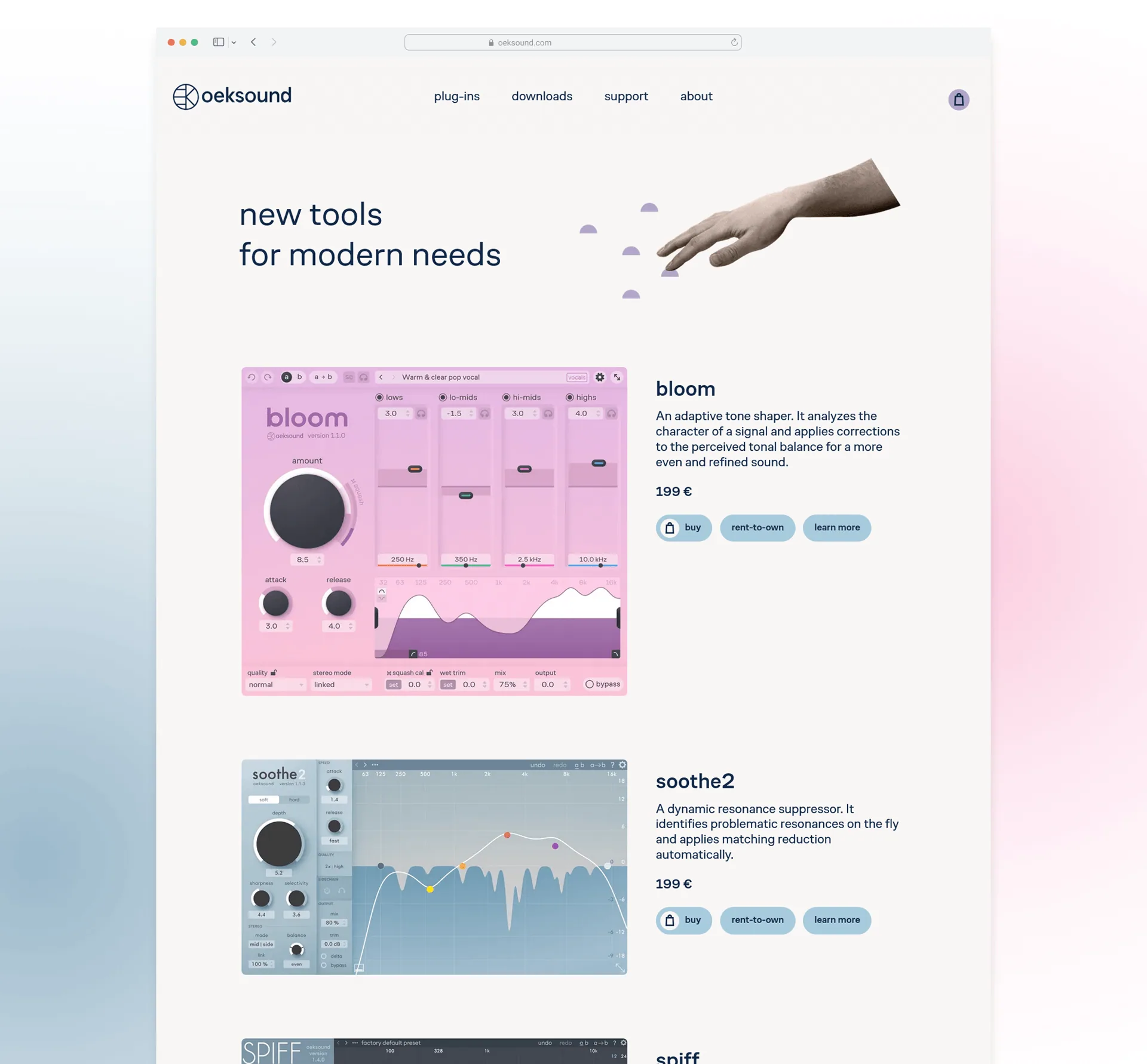
Working with the developers
In a company this small there was no wall between design and development. I worked with the developers in short loops and followed each product from the first sketches to the release builds.
Plug-ins run inside lots of different host apps, and their windows can be resized. So I designed for scaling from the start, with simple shapes, steady spacing and type that still reads when the window is small.
What reviewers picked up on
soothe2, spiff, bloom and soothe live look like one family and work the same way. soothe live came out in April 2023 as oeksound’s first product for live sound.
Reviewers kept bringing up the interface. Recording Magazine wrote: “The soothe GUI is spacious, clean, and intuitive.” EDM Prod wrote: “For such a complex plugin under the hood, the interface is surprisingly user-friendly.” Magnetic Magazine found the soothe2 interface “highly functional right from the moment you drag it onto a channel”. MusicTech gave bloom 9/10 and listed its “fluid and intuitive user interface” among the pros.
How much to show
The hardest part was deciding how much of an adaptive process to show. Too little and people don’t trust it. Too much and the graph turns into noise.
bloom taught me to check what I take away when I simplify. Fewer controls made it quicker to use, but the one thing reviewers missed was delta, the switch that lets you hear exactly what the processing removes.