WorkAalto University Magazine
A magazine in two languages, where Finnish runs long
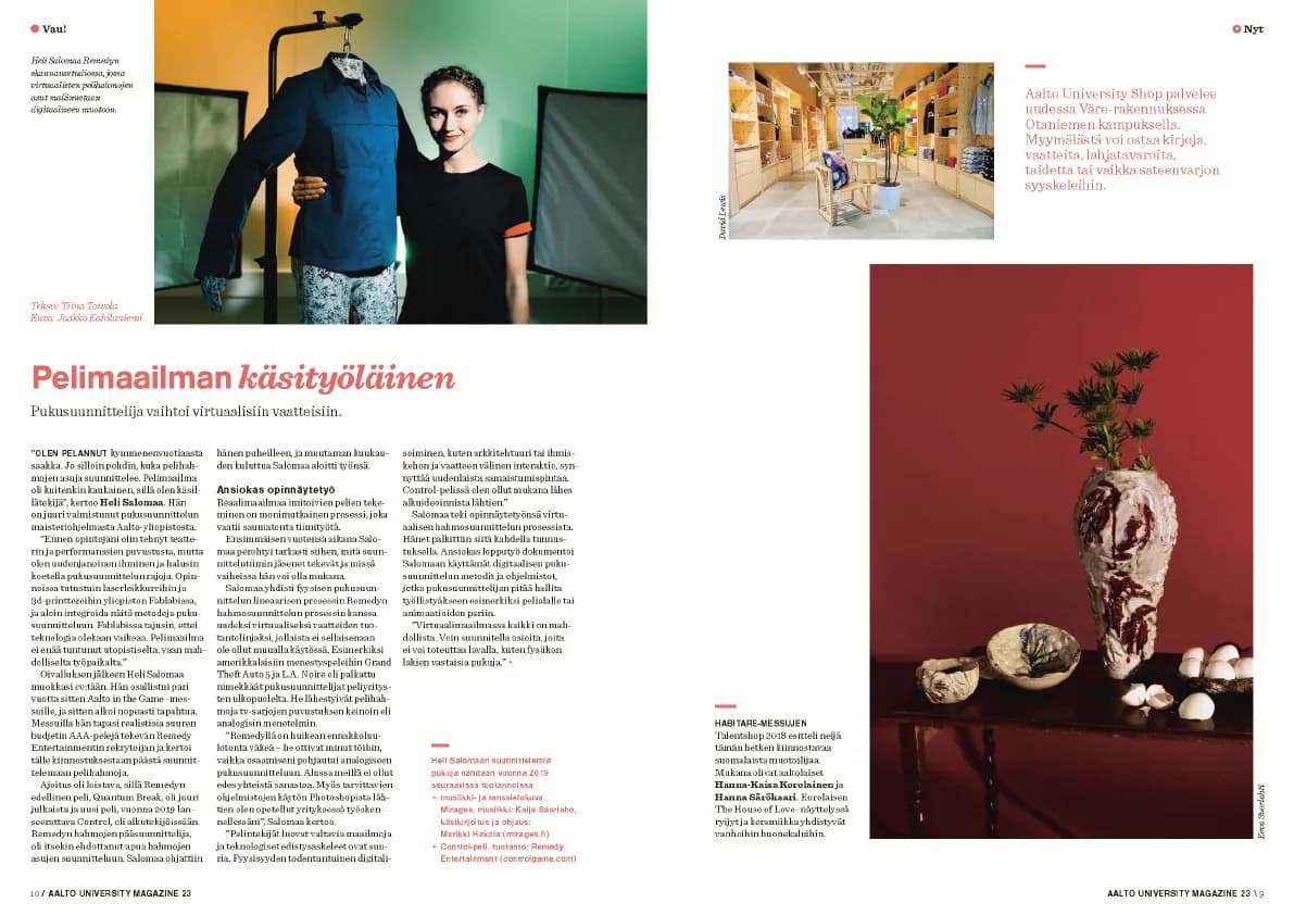
Layouts, art direction and print production for Aalto University’s magazine in Finnish and English, with the editors and the illustrators and photographers I hired.
Freelance editorial designer (part-time), 2018–2019. Editorial.Back issues on Issuu ↗
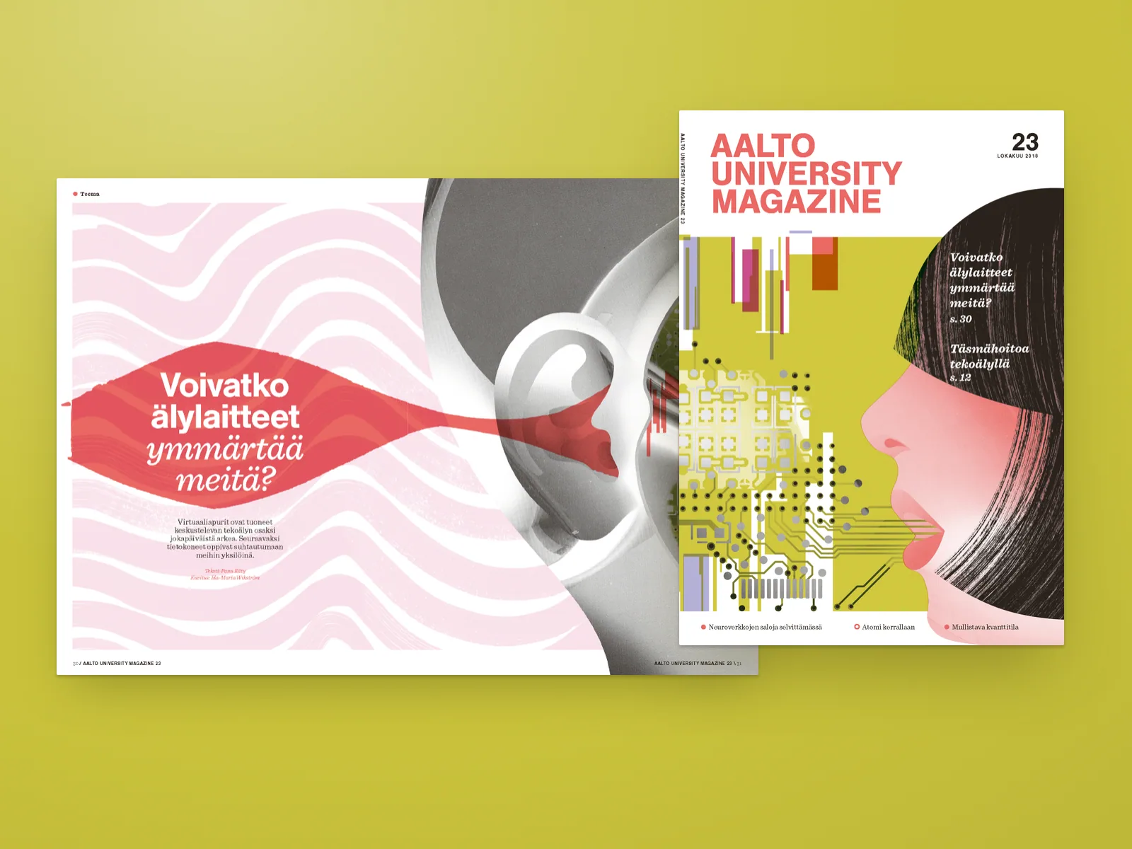
Aalto University Magazine tells the university’s research, art and business stories to readers on and off campus, in Finnish and English. I worked on it part-time as a freelancer: layouts, art direction, hiring illustrators and photographers, and the hand-off to the printer.
Two languages double every type problem. Finnish words run long, so headlines and columns had to hold either language without rebuilding the page. In headlines I paired a bold sans with an italic serif, so the emphasis could move with the sentence instead of sitting on a fixed word. The same pairing ran from the cover lines to the feature openings.
A lot of the image work was choosing who should make it. For the issue on smart devices I worked with illustrator Iia-Maria Wikström, whose collage of circuit boards and skin tones runs from the cover into the feature. My part was the frame around it, the grid and the type, with enough room for the illustration to lead.
I was also the link between the editors and the printing house, with final files, colour checks and the schedule. That part is mostly careful, boring work, and the reward is a magazine that arrives on time.
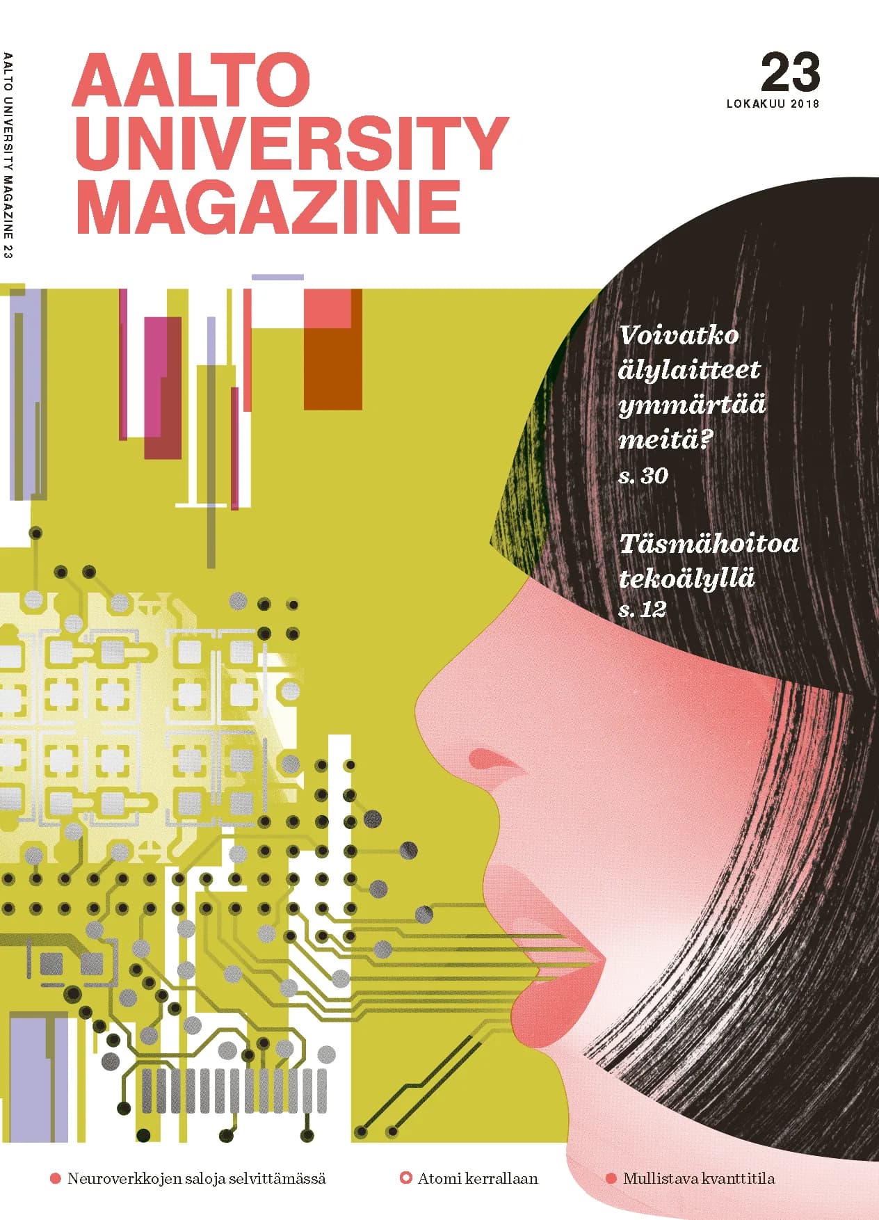
Cover lines inside the image
The cover lines sit in white italic serif on the darkest part of the illustration, with no box behind them. The illustration keeps the whole cover and the text still reads at arm’s length.
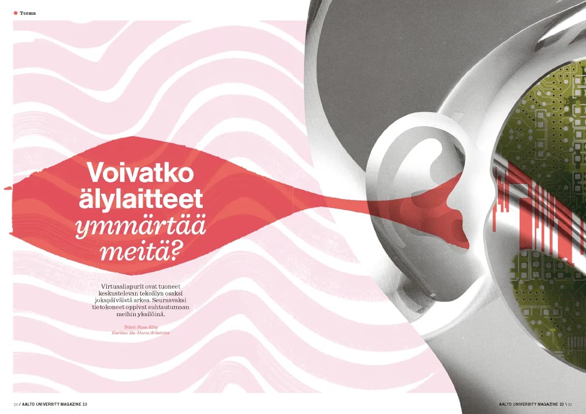
Two voices in one headline
The sans asks the question and the italic serif carries its human half. Repeating the pairing in every issue made it the magazine’s voice, so features could change style completely and still feel like the same magazine.