WorkMikebon
A wholesaler’s whole system, rebuilt in-house
Mikebon prints and sells souvenirs and clothing from one Finnish warehouse, and for years it bought all of its tech from outside. I came back and built the system it runs on now, then took the running of it in-house.
Designer & developer, October 2025 – ongoing
Stores, people, orders, sales figures, pallets and club shops in the screenshots are sample data.
The number that changed it
70%of a regular reseller’s order is a restock
Every later order line from the 31 resellers with five or more orders, 27,185 lines in all.

Mikebon prints T-shirts, hoodies, caps and souvenirs and sells them from one warehouse in Finland. Gift shops and tourist stores buy wholesale, sales reps drive from shop to shop taking orders, and consumers buy online.
I first worked there in 2016–2017, on the brand and the old web store. When I came back in October 2025, the company had no tech people of its own. Servers, the webshop and IT support were all bought from outside, and the way orders moved had hardly changed since around 2000. A reseller’s order was written on paper and sent by WhatsApp or email, and someone in the office typed it into the ERP. It was slow, and people did the same work several times over.
Over the next year I designed and built the pieces one at a time and took the running of them back into the company. What I wanted was tools that take the dull work off people and bring in more orders.
Data in too many places
Five groups work off the same shelves: consumers, resellers, sales reps, the office and the people on the warehouse floor. Each needs its own view of the same products and stock.
The data lived in too many places. The ERP, DAFO, held the master product data. The old webshop held two years of reseller history that nothing used. On the B2B side there was no stock at all: someone ticked a size as available by hand. Any change to any of it meant a ticket to a vendor.
Every group needed its own tool, and all of them had to agree on what was on the shelf.
Build the B2B store around the reorder
Resellers order on mikebon.store. Each store sees its own assortment, and one size table takes a whole order line at once, every size in one go. Before designing the next screen, I checked what resellers actually do there.
The next screen is “Tavallinen tilauksesi”, your usual order: a standing list of what each store buys, with the usual quantities filled in.
Read the reasoning
Two years of order history, 27,185 lines across 4,768 orders, gave a clear answer. For the 31 resellers who ordered five times or more, 70% of every later order line was a product they had bought before.
So the store was asking the wrong question. A reseller opened a catalogue of about 2,000 products to find the 40 or so they always buy. The screen that follows is “Tavallinen tilauksesi”, your usual order: a standing list of what this store buys, sorted by how often and how recently, with the usual quantity filled in.
Two rules came from the data. Quantities are suggestions and never submit themselves, because quantity is where real money goes wrong. And the screen has to step aside honestly: one in six resellers buy something different every time, and a thin list would look broken to them.
I chose not to build a learned recommender. A few dozen resellers is far too little data, and a confident wrong suggestion costs a rep credibility.
The same data changed how I saw the move off the old shop. Only one of those 31 regular resellers had an account there, so the migration is really a sales job: winning 30 businesses Mikebon already sells to. The purchase tables come first, then the reorder screen.
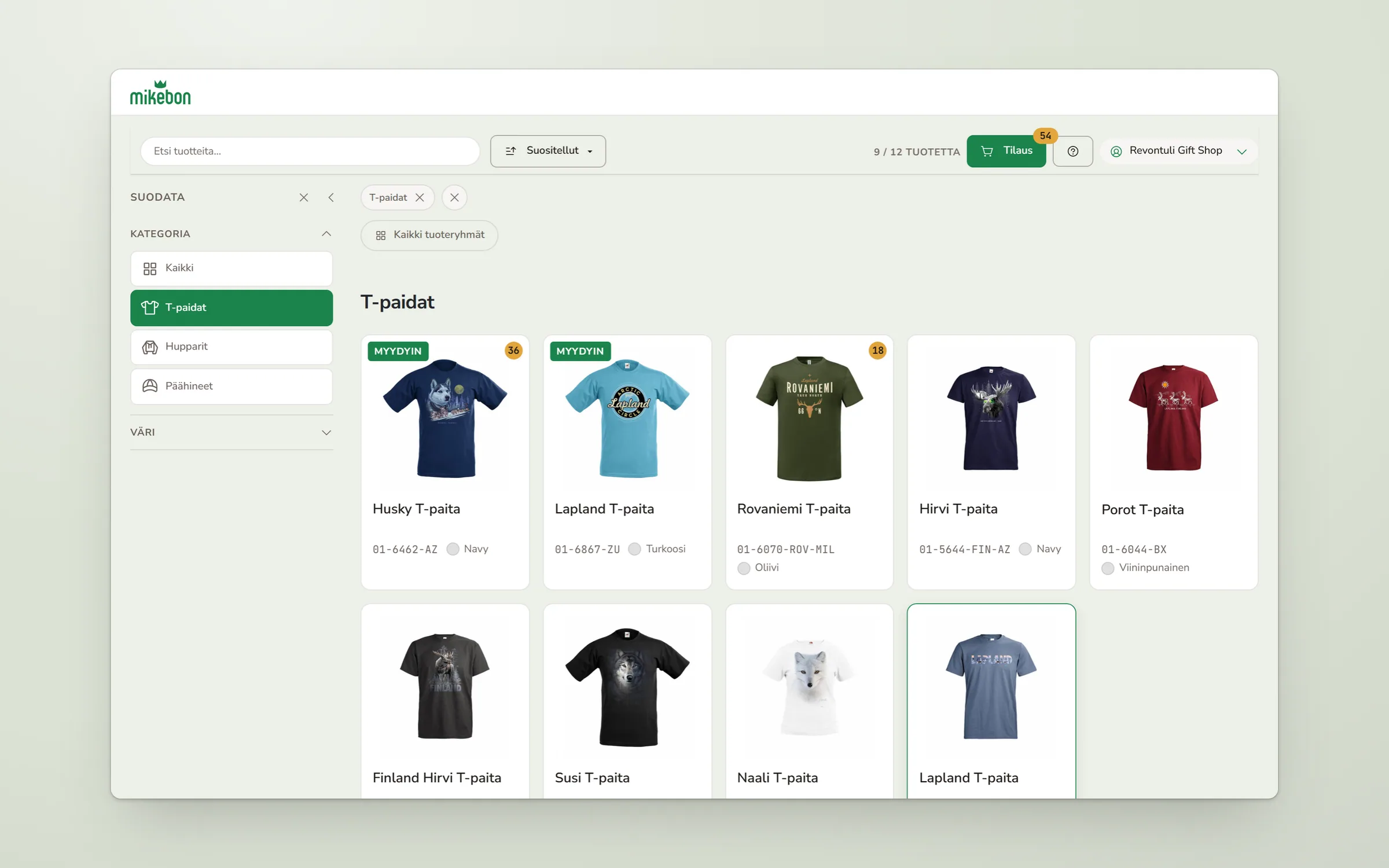
Counts where the eye already is
A badge on the card says how many are in the order. A reseller scrolling the grid can see what they already took without opening the basket.
The order keeps count
The piece count sits on the order button, so a reseller always knows the size of the order before opening it.
Filter first, then one signal that matters
Sales reps order on a tablet in the shop, often on a weak connection. Their app opened on a grid of about 30 identical cards, each with the same red “Ei myymäläkuvia” (no store photos) badge. The only coloured thing on screen fired on nearly every store, so it read as decoration. Finding one shop meant reading all of them.
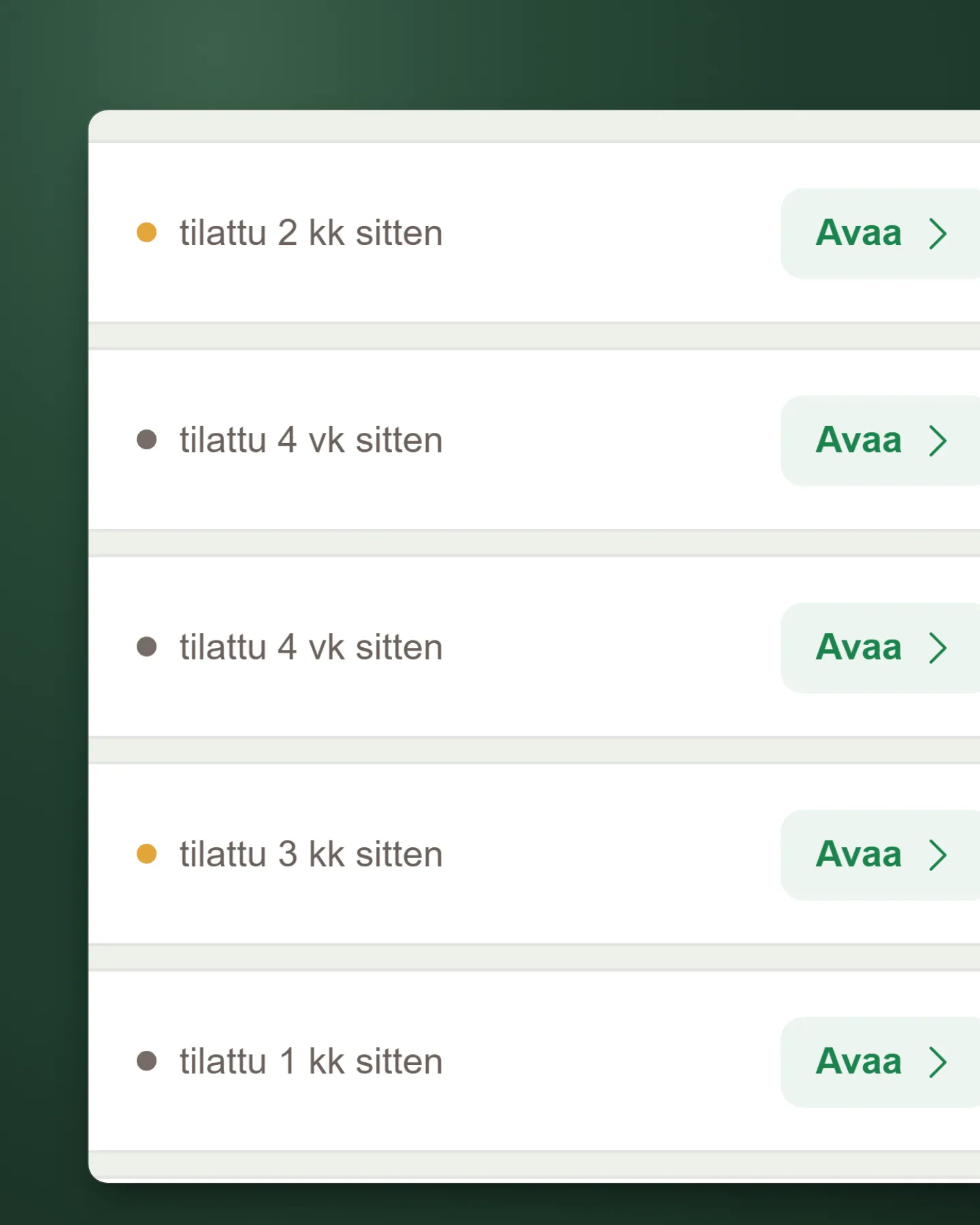
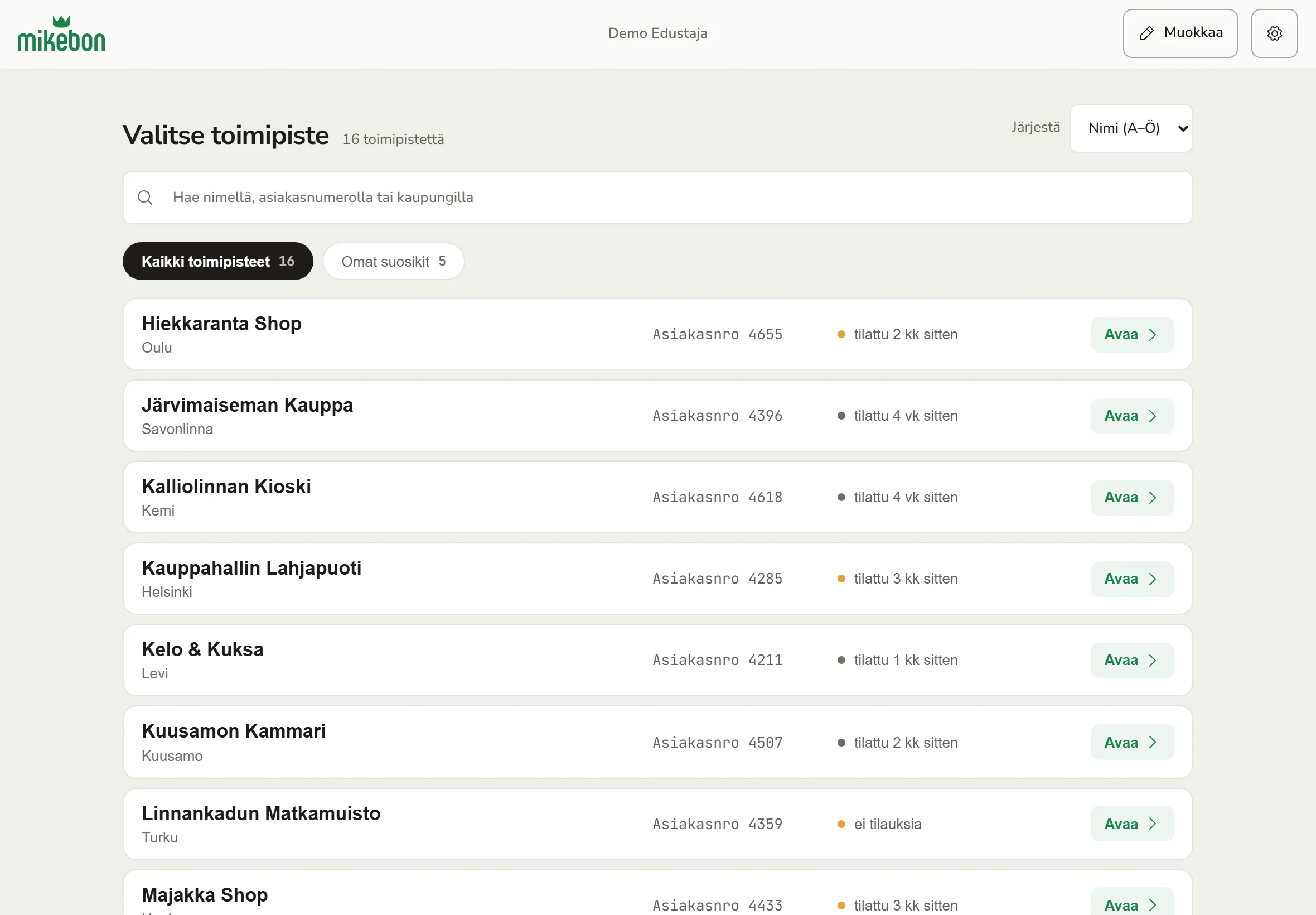
The picker became one list of rows, sorted by name or by postal code, with how long ago each shop ordered where the old badge was.
Read the reasoning
I turned the cards into rows with fixed columns: name and city, customer number, status, action. The eye runs down one column instead of reading every tile. The customer number is set in mono and aligned, because that is how a rep tells two same-named chain stores apart.
The badge left the row. In its place is order recency, “tilattu 3 vk sitten” (ordered three weeks ago), which is what a rep actually plans a route with. A dot carries the urgency, and the words stay in a colour that passes contrast.
The first prototype grouped stores by region behind a filter rail. The data said no. There is no region field, and grouping a real 30-store roster by city gave 26 groups, 22 of them with a single shop: longer than the flat list. Postal codes were clean, so the “Alue” (area) sort uses them instead. Neighbouring shops in the same district went from 4 to 13 pairs, and the list now reads like a driving day.
Alphabetical order stayed the default, so no rep lost the positions they had learned. “Omat suosikit” (my favourites) comes from the rep’s own orders and disappears when it would be empty.
The version I threw away
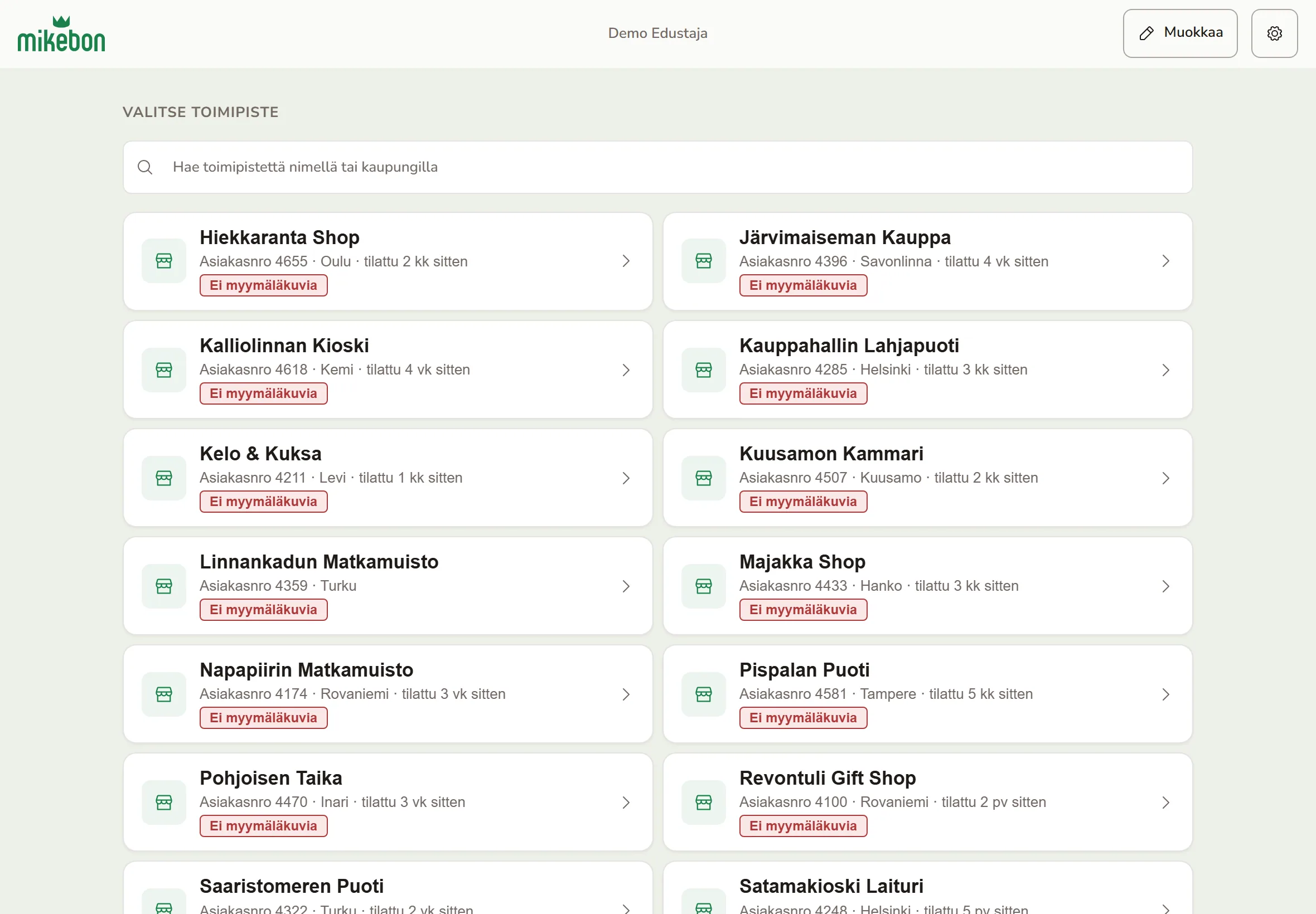
Before: Always on means noise
This badge fired on nearly every store, so the only red on the screen told the rep nothing about where to go next.
The signal a route is built on
Order recency replaced the photo badge. The app already had this data. It just was not on the screen where reps decide where to drive.
Mono, in a fixed column
Digits line up down the list. That is how a rep avoids checking into the wrong one of two shops with almost the same name.
Put the whole office in one place
The office used to work across the ERP, the old webshop’s admin, email and spreadsheets. The admin on mikebon.store is where the new system lands: orders from every channel, products, store assortments, sales reps, club shops and support messages, in twelve screens.
The office now works from one admin that opens on a feed of the day, instead of the ERP, email and spreadsheets.
Read the reasoning
It opens on a feed of the day. Which rep sent an order, who added display photos at which store, what the office took off a store’s shelf. Analytics answers the questions the owner actually asks: which stores have gone quiet, which carts are sitting unsent, and what people searched for and didn’t find.
A search with no result is a product somebody wanted, so that list sits next to the best sellers. A cart left for more than a day gets a red label, because it is an order that hasn’t happened yet.
The admin also did the slow rescue work from the old shop. 1,501 product photos came across through an import screen, and the official 240-code colour register now lives here, since the ERP has no place for it.
Several people use it, so access is deny-by-default. Each admin endpoint names the permission it needs, a new endpoint stays locked until it is listed, and a test fails the build if one is missing. Deletes go to an archive the office can restore from.
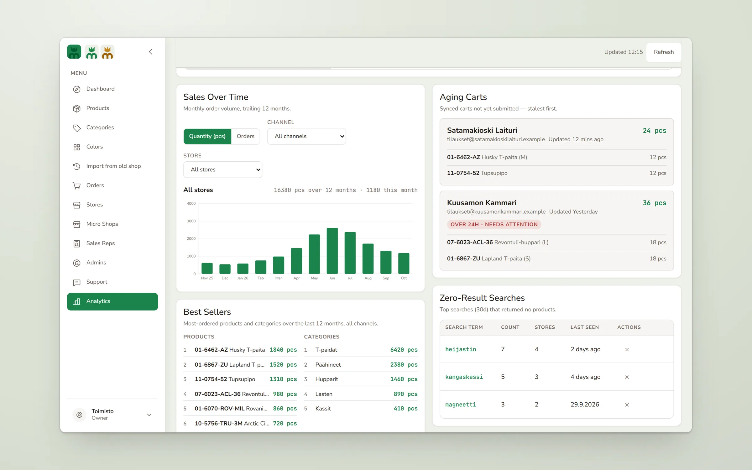
An unsent cart is a phone call
After a day the cart turns red. That is the office’s cue to call the store, which is cheaper than waiting for the order that never comes.
What people looked for
Searches that found nothing are listed with how many stores tried them. It is the cheapest product research the company has.
One shell, themed per club
Mikebon wanted small branded shops for clubs, schools and events, with more coming. The first club shop was a long order form defined in code. A new shop, a logo change or even an on/off switch needed a developer and a deploy.
A new club shop is a name, a logo and one colour, and the office sets it up in admin without me.
Read the reasoning
I made a shop a database record served through one page shell. An admin sets a name, a logo and one brand colour. From that colour the shell derives five tokens: the primary colour, a hover shade, two tints, and the text colour on the brand, white or near-black, whichever reads better. If no choice reaches 4.5:1, admin warns before the shop opens.
The trade-off was reuse against risk. The club shops share the styles and components of the business store but run on their own small script, so the live store resellers order from is never touched. Retail orders get their own collection too. A guest order mixed into business orders would leak into rep history, best-seller rankings and the office export.
Opening a shop is now something the office does in admin.
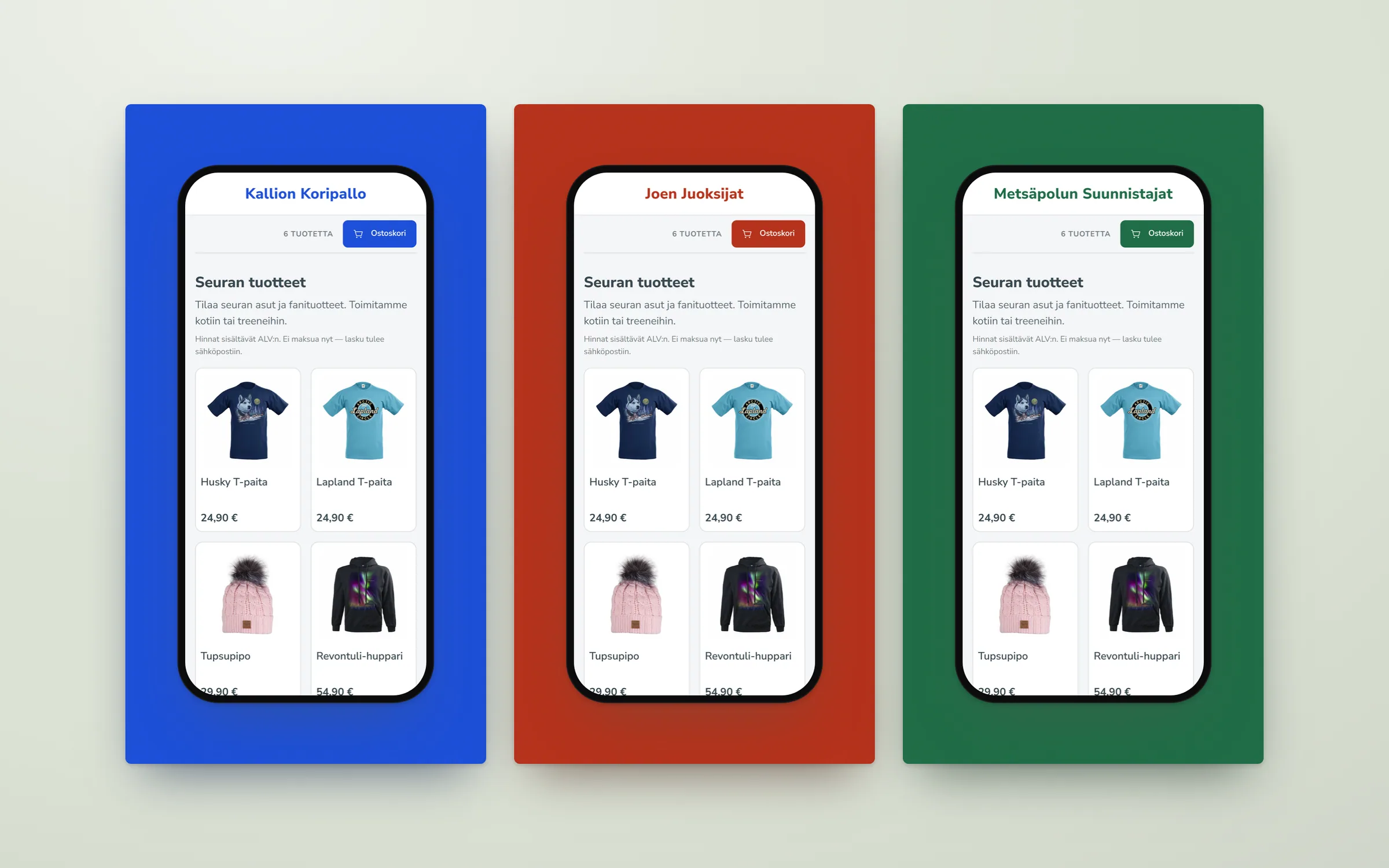
One input, every state
The admin picks one colour. Hover, tints and the text on the button are derived from it, so a club cannot end up with an unreadable basket button.
Name and price before the photo
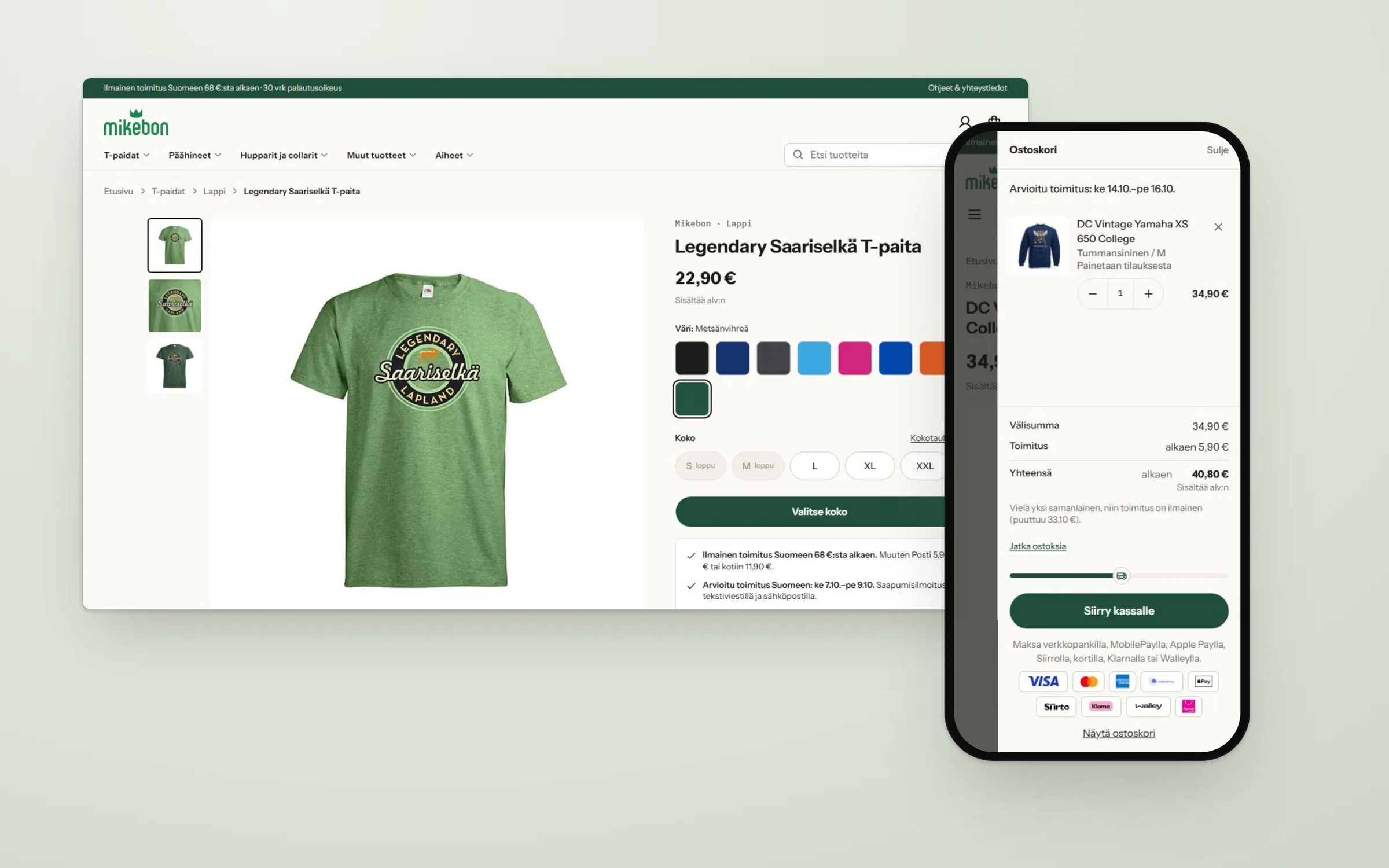
mikebon.fi is the new retail webshop, replacing the old one on PrestaShop. It is built for one path: a search result lands on a product page, and the visitor buys. It works out its own delivery dates, so a size that is printed to order shows a later date before anyone has to ask.
On phones the price is now on the first screen, and a slim buy bar stays with you once the real button scrolls away.
Read the reasoning
Before launch the shop went through a structured UI/UX review in three passes, on phone and desktop. I triaged its 78 findings, accepted 74 and built every one of them.
The top finding was measured. On a phone screen 844 pixels tall, the price started 760 pixels down, hidden behind the cookie notice on a first visit. The buy button sat around 1,100 pixels down.
On phones I moved the name and price above the photo, cut the top strip to one line and dropped the thumbnail row, since the photo already swipes. A slim bar with the price and “Lisää ostoskoriin” (add to basket) appears once the real button scrolls away. Desktop keeps its two columns, where the price was never the problem.
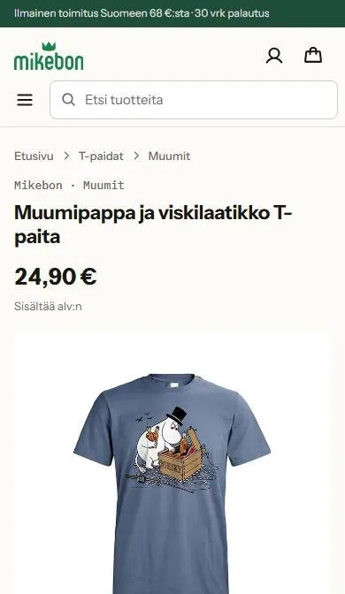
The version I threw away
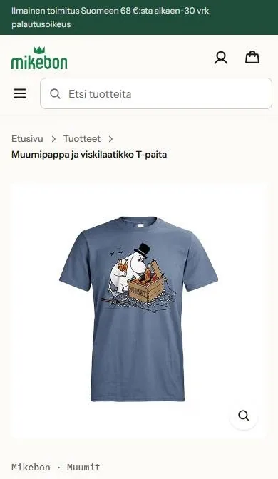
Answer the open question first
Visitors arrive from search already knowing what the shirt looks like. What they don’t know yet is the price, so it comes first.
Printed to order, said out loud
This size is printed when you order. The basket says so, and the delivery estimate above it already counts the extra days.
Make every pallet findable from the floor
The newest piece is lavapp, pallet tracking for Mikebon’s own warehouse. Pallets were labelled with handwritten sheets in a different format every time, and the rest lived on paper and in Excel. Nobody could say for sure what was in stock or where without climbing up to look.
Pallets and rack sections now carry printed codes the driver scans from the floor, so one person can do the stock-take alone.
Read the reasoning
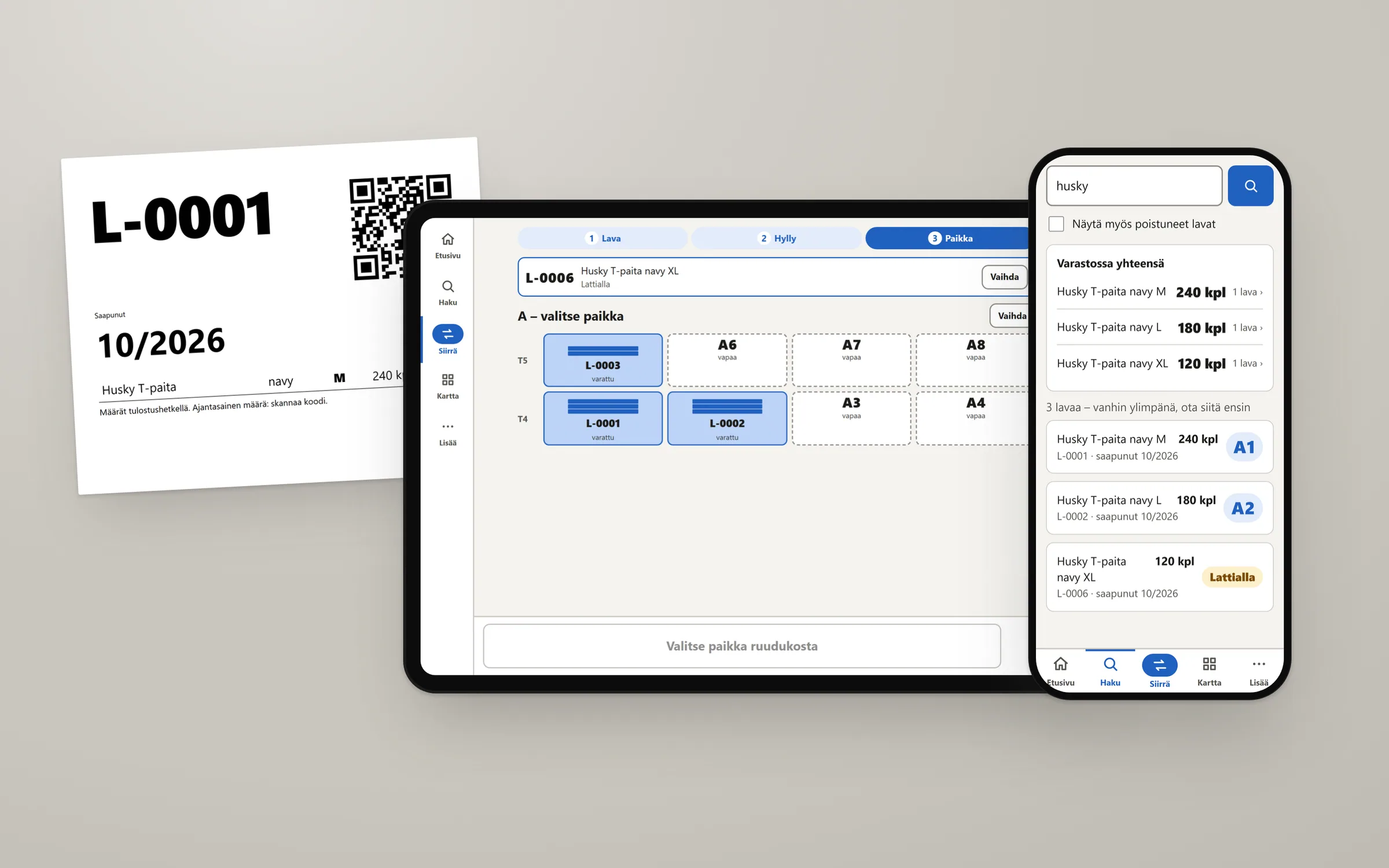
The physical layer matters as much as the screens. Every pallet gets an A4 sheet from the office printer, in a pocket facing the aisle: a huge pallet number, the arrival month in large print and a QR code. Each rack section has one code at eye height on the upright, so the driver scans from the floor and taps the spot on screen. That covers all 64 spots without a label up high.
My first version tracked pallets only, with no piece counts, because every extra field makes an update slower and slow updates are how records drift. Then the owner asked for a running stock count, so I changed my mind. Each line on a pallet now has a count, and one person can do the whole stock-take alone: scan the sheet, type what is on it, scan the rack.
Three groups use it differently. The forklift driver gets a tablet with three steps and big targets. Staff find stock on their phones, and search lists the oldest arrival first, so old stock leaves first. The office registers deliveries and prints sheets on a desktop. Everything is in Finnish, because that is the language on the floor.
I designed a weekly spot check and then cut it. What stayed is one list to clear every Friday: pallets that are missing or have sat on the floor too long. A failed save never disappears quietly. A red message stays on screen until it is retried.
Age at a glance
The arrival month is the second-largest thing on the sheet. Old stock should leave first, and the driver can tell which pallet is older without scanning anything.
The rack as seen from the seat
Taken spots show their pallet number and free spots are dashed outlines. A taken spot asks before it overwrites anything.
The address is the answer
Search answers one question, where is it, so the rack address is the biggest thing on each result.
Where the old ERP fits
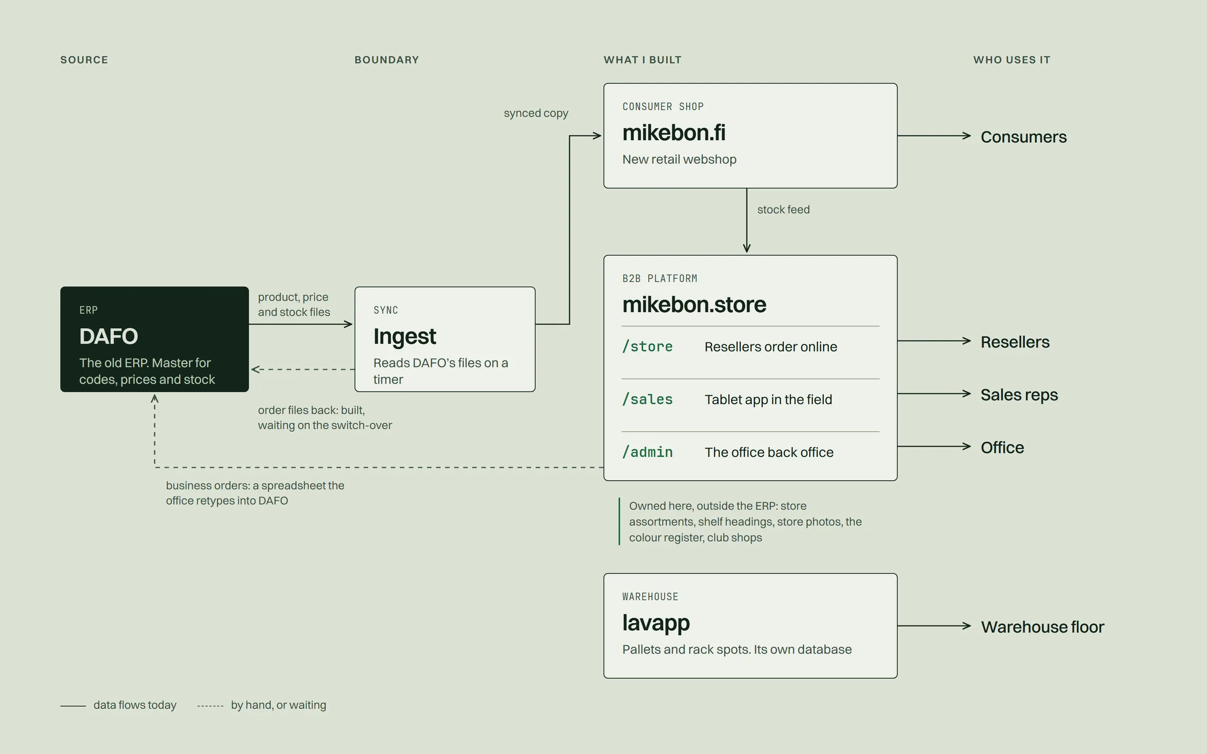
DAFO, the ERP, stays the master for product codes, names, barcodes, prices and stock. Early on I planned for the new system to become its own master, and I dropped that plan.
What changed is everything around it. Before, nothing read DAFO on its own: product data came out as hand-exported Excel files. Now one ingest reads DAFO’s files every 15 minutes, the consumer shop keeps a synced copy, and the B2B platform pulls stock from it every 10 minutes. Neither shop calls the other while serving a page.
Read the reasoning
The rule that holds it together: facts are shared, curation is local. Codes, names, prices and stock come from the ERP, and neither shop edits them. Which products a store carries, its shelf headings, store photos, the colour register and club shops belong to the new system, because the ERP has nowhere to put them.
Orders going back are the unfinished part. Business orders still reach the office as a spreadsheet that someone retypes. The consumer shop already writes DAFO’s own order files, switched off until the ERP side starts reading them.
The B2B platform has its own written design system: warm, quiet and editorial, with forest green as the accent and a mono face kept for codes, barcodes and dates. Every text colour clears WCAG AA, 4.5:1, on all four backgrounds it can sit on. The amber warning colour is the one documented exception, used only for fills and borders.
The boundary is the design
Once the feed between the ERP and the shops is defined, the ingest can later move into a service of its own without either shop noticing.
The part still done by hand
Business orders still go back as a spreadsheet. Writing them straight into the ERP is the next big piece.
Every state is automatic
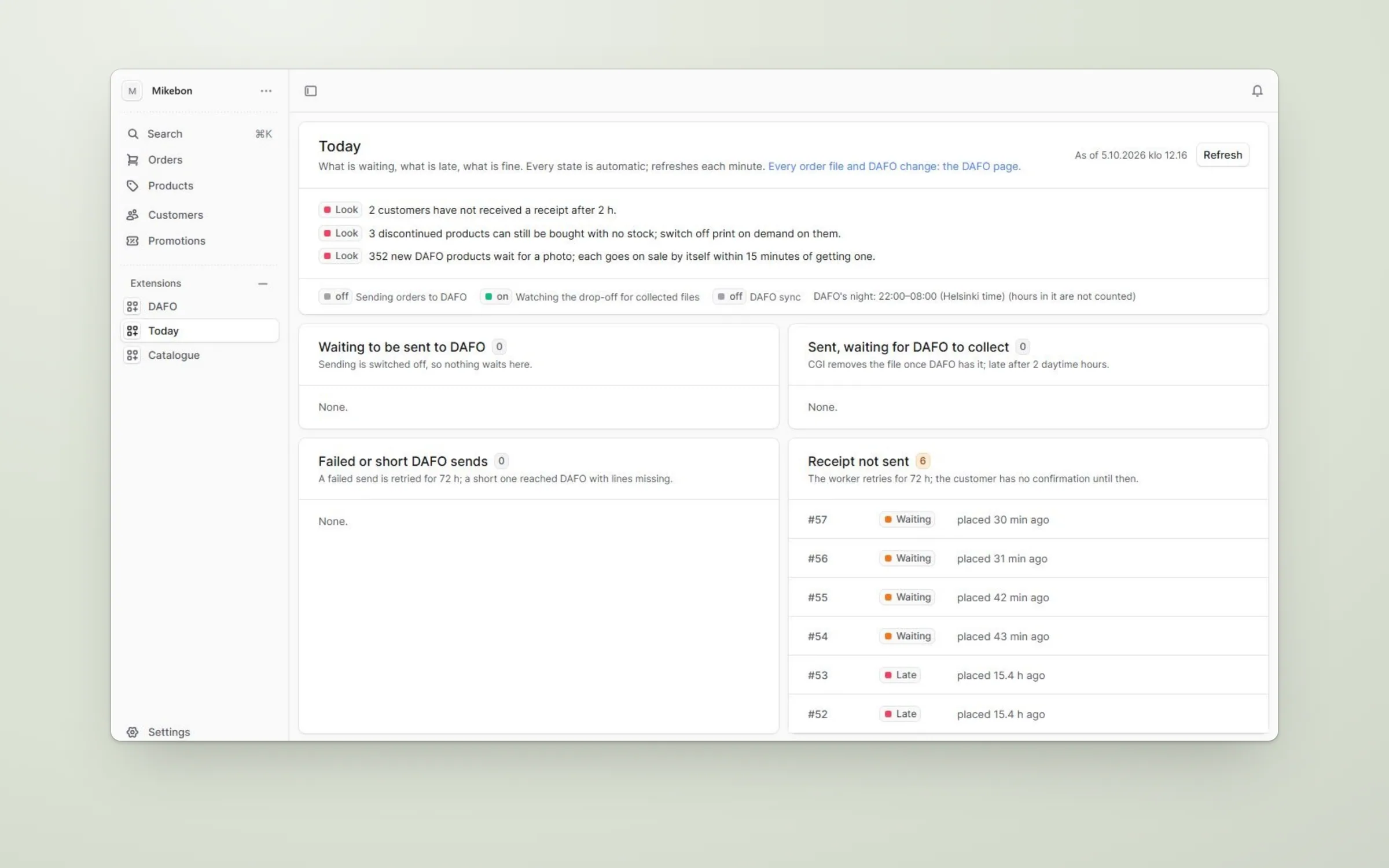
Nobody ticks anything here. Each card fills itself and refreshes every minute, so the page only asks for attention when something is actually stuck.
The ERP keeps office hours
DAFO collects files only in the daytime, so night hours don’t count towards “late”. Without that, every morning would start with a page full of red.
Taking it in-house
I designed and built all of it, and I run it. There is no outside IT company behind it any more. When the office has a problem, it comes to me.
The B2B platform runs on Railway with a hosted MongoDB database, and the consumer shop on Cloudflare and Railway. Every change goes through lint and the test suite, 1,632 tests on the B2B side, and a push to the main branch deploys it.
Read the reasoning
The rep app is an installable web app for tablets. It scans EAN barcodes, photographs shop displays with an in-app camera and keeps working on a weak connection: orders wait on the device and send when the network comes back, without ever sending twice.
Running a live system alone means writing down how to recover it. Nightly backups go to a server the owner keeps and are kept for 60 days. A health check runs every five minutes and emails me if it fails twice in a row. All of it is on one operations page the owner can follow without me.
In daily use
The B2B platform is live and in daily use, with about 70 reseller stores, 1,200 products and around 200 orders placed through it so far. Those are the B2B platform’s numbers alone. Counted across all of Mikebon’s shops, business and consumer, the totals will be larger soon.
Reps work from a short store list that shows what they plan routes by, and they see real stock for the first time. The office has one place to look.
The consumer shop is ready and launches by spring 2027 at the latest. lavapp is built and goes into daily use on the warehouse floor soon. Mikebon no longer buys its IT from outside.
What I would do sooner
Twice, the data changed the plan before I had built the wrong thing. The region grouping looked right in the prototype and would have made the store list longer. The reorder screen looked like a nice-to-have until the order history said most of a reseller’s order is a restock.
I also changed my mind in the warehouse. I left piece counts out of lavapp on purpose, and the owner was right to ask for them. A stock-take done by one person only works if the counts are there.
Taking everything in-house means I am also the one who gets the call. Next time I would ask for the ERP’s customer register on day one. It turned out to be the key that links old webshop customers to new store accounts.
Next: the purchase tables, the reorder screen, and business orders written straight into the ERP instead of a spreadsheet someone retypes.