WorkWreckfest 2
Menus that look like a garage someone works in
UI for a demolition racing sequel. It began as my own proposal in 2024, and from December 2025 I worked on the game at Bugbear as Senior UI artist.
Own proposal, then Senior UI artist, 2024–2026. Game UI.
The screens on this page are my 2024 proposal, made before I joined the studio. My work at Bugbear is confidential and isn’t shown here. Wreckfest is a trademark of THQ Nordic.
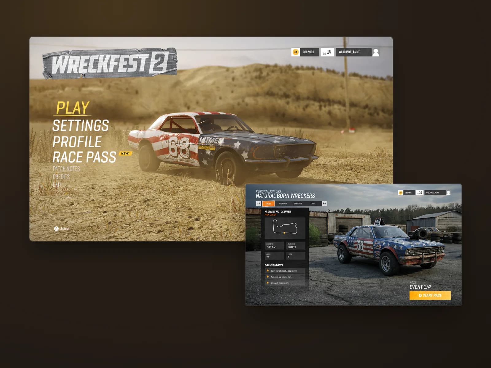
In 2024 I put together a UI proposal for Wreckfest 2. In December 2025 I joined Bugbear in Helsinki as Senior UI artist on the game, on a fixed-term contract, designing UI and building it in the studio’s own engine. That work is confidential, so this page shows the proposal.
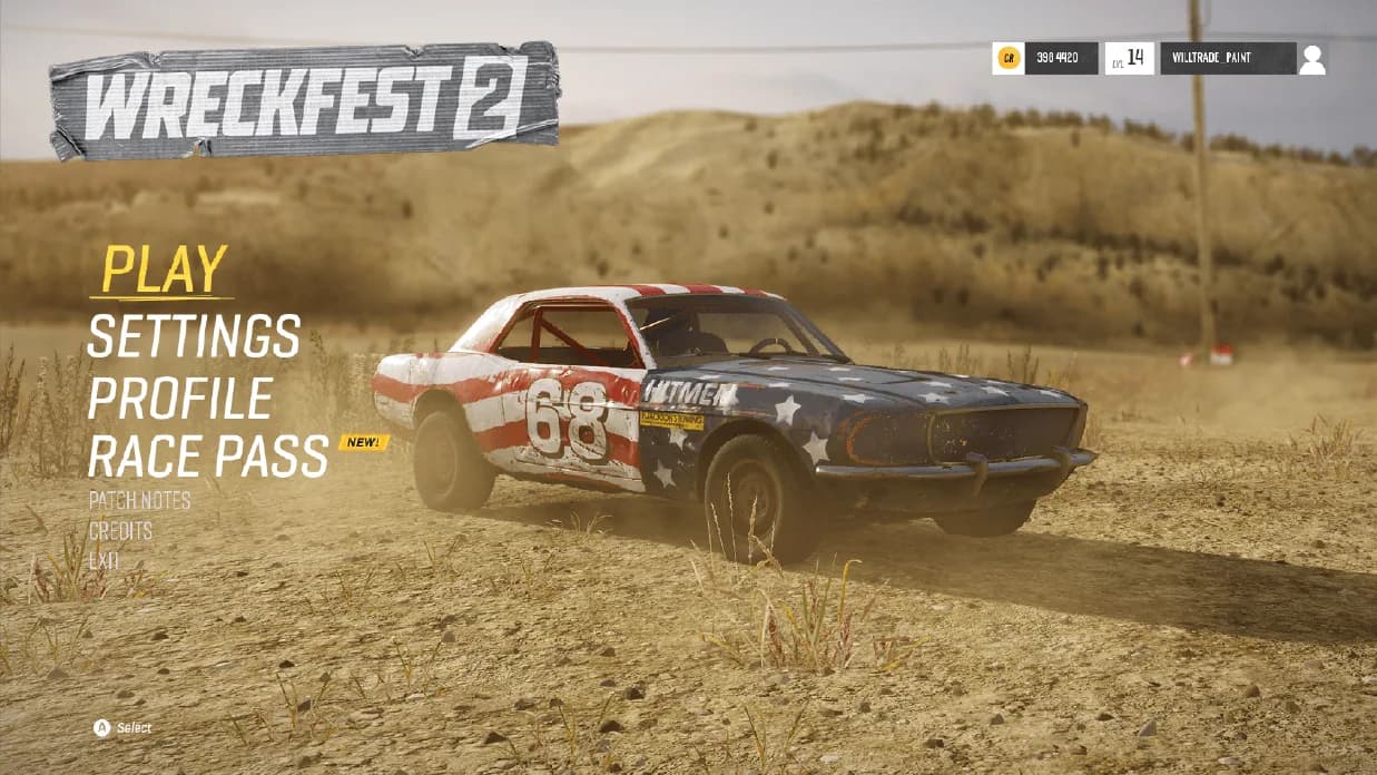
Wreckfest is a game about wrecking cars in the mud. I wanted the menus to belong to the same world, like a garage someone actually works in. The brief I gave myself was to make the UI feel physical and still keep it as readable as a modern console menu seen from the sofa.
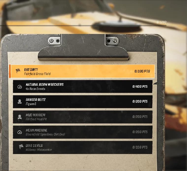
The career screen is a clipboard. Events sit on a worn sheet clipped to a board, like a heat list pinned up in the pits. The board is also the edge of the current championship, so you always know what you are choosing between.
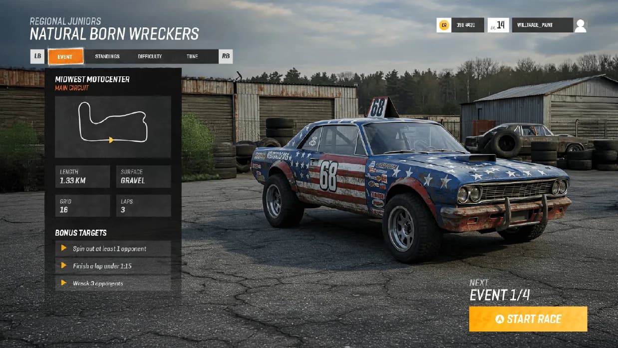
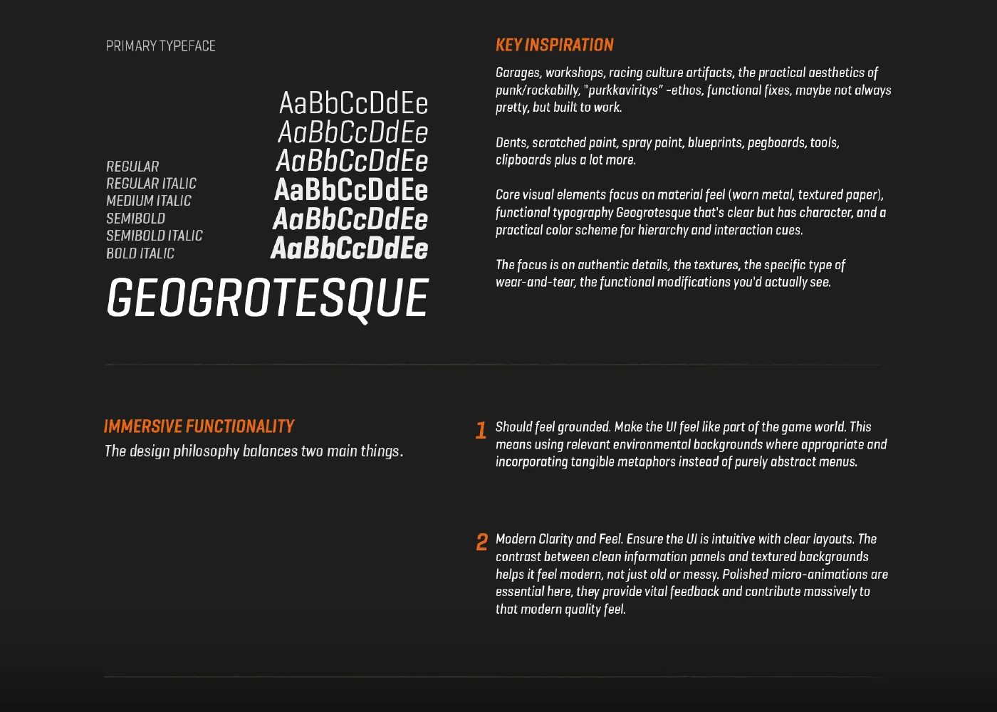
Geogrotesque, a condensed italic, gives the type some speed and fits long event names on one line at TV size. Orange marks focus and progress: the selected event, the active tab, the championship bar and the Start race button. Everything else stays dark and neutral, so you find the selection in one glance even over rusty, busy backgrounds.
Texture costs legibility, so I kept it at the edges. Information panels are flat and dark, and the materials live in the frame: the clipboard, the paper, the taped logo. The garage is the busiest screen, so every car card repeats one fixed layout and only the focused car changes.
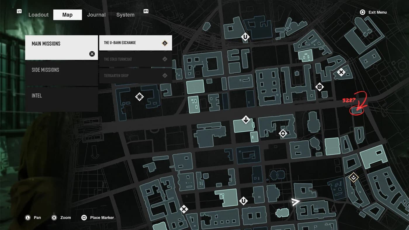
Doppelganger, a stealth concept of mine set in 1970s Berlin, takes the same ideas somewhere colder. Its map screen keeps one quiet accent and lets hand-drawn marks sit on top, as if pencilled onto a paper map.
Static screens only set a direction. Game UI really gets decided in the engine with a controller in your hand, and that is what I did at Bugbear until the contract ran its term.
One bright row
Focus is the only warm, bright row on the sheet. With no glows or outlines, the selection is still the first thing you see from the sofa.
The clip is the boundary
Everything under the clip belongs to one championship. The object shows where you are, so the screen doesn’t need another heading.

Compare in the same spot
Every card puts ownership and class rating on the same bottom line, so you compare cars by glancing sideways along it.